Category: Email Marketing

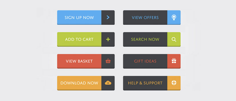
Calls to action (CTAs) refers to texts, links or buttons that invite users to perform an action. In email marketing it is especially important that the CTAs are strong, striking and attractive, as they are primarily responsible for increase the conversions of your mailings.
Be concise. It is proven that the call for effective action is the one that has 5 or fewer words, so take your time to decide which message you want to give and find the shorter and more concise way to display it.
Denote urgency. Once your subscriber has read your mailing, what do you want him to do? To make a purchase? To try a product?... Whatever action you want him to do, denote urgency in your CTA's message to do it. For example, if you want your subscriber buy a product use "Buy Now" or if You want him to download an e-book use "Download it now" because they are short, urgent and effective messages.
Repeat your CTAs. It is recommended to repeat your CTAs in several different locations in your email so the user will have more than one opportunity to click on them. They can be displayed in different formats over email: through images, links, buttons...
Define objectives. Remember that all your campaigns should have a primary objective. You probably have several objectives but have to set priorities and an execution order. This should be apparent when defining your calls to action by sharing the same message. You can't put "Buy now", "Download it now" and "Get a discount coupon" in the same email because your subscriber will not know what to choose between so many different messages.
Position. Note that the position of the call to action in your email can make it effective or not even seen by the subscriber. When you open an email the part called "above the fold", which is located at the top of the mailing and is seen with no need to scroll through the rest of the email, is the most important. That, undoubtedly, is the place where you should locate your main call to action.
Once explained the main features that should share your calls to action, you wonder... How can I highlight them?
Remember that all calls to action should have links that lead, for example, sections of your site that relate to the message you're releasing.
Do not miss anything from our blog and join our Telegram https://t.me/acrelianews
Haven't you tried Acrelia News yet?
If you like this post, you will like much more our email marketing tool: professional, easy to use.