Category: Email Marketing Trends
After discussing the trends for email marketing in 2024, we want to share some specific design insights that you can apply to your campaigns. If you take advantage of the new year to make adjustments to your strategy, it's also a good time to choose a new template or simply make small tweaks to the one you already have to give it a more modern feel. Always remember that trends should not make you lose your corporate identity, but you can use them to reinforce it.
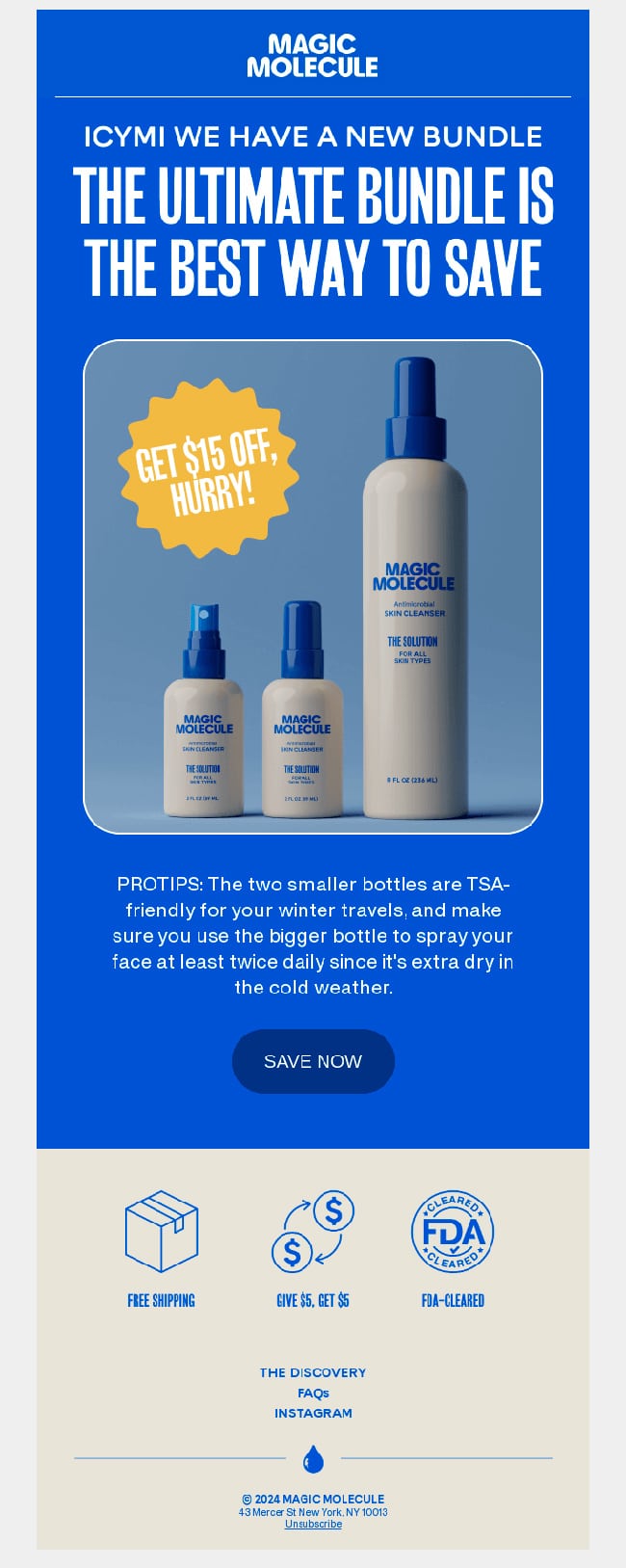
Let's start with a question: have you already embraced minimalism? This trend continues to rise to focus the user on what's important, eliminating unnecessary noise. Simplify! Add white space, make the fonts larger, reduce the text, and select a few images. A clean design is more direct and aids conversions because it highlights the buttons more.
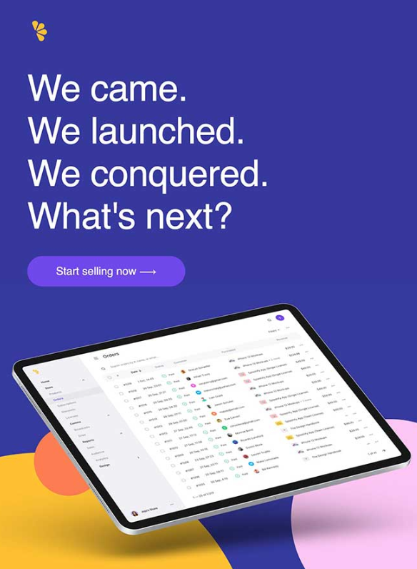
When the goal is to stand out, you need to look for fonts that grab attention because they impact as much as they convey sensations through their shapes. Typography and corporate colours can be used creatively to provide a variety of styles depending on the type of message you want to convey. For example: bold or clean calligraphic fonts are opposite but may be necessary for different mailings.
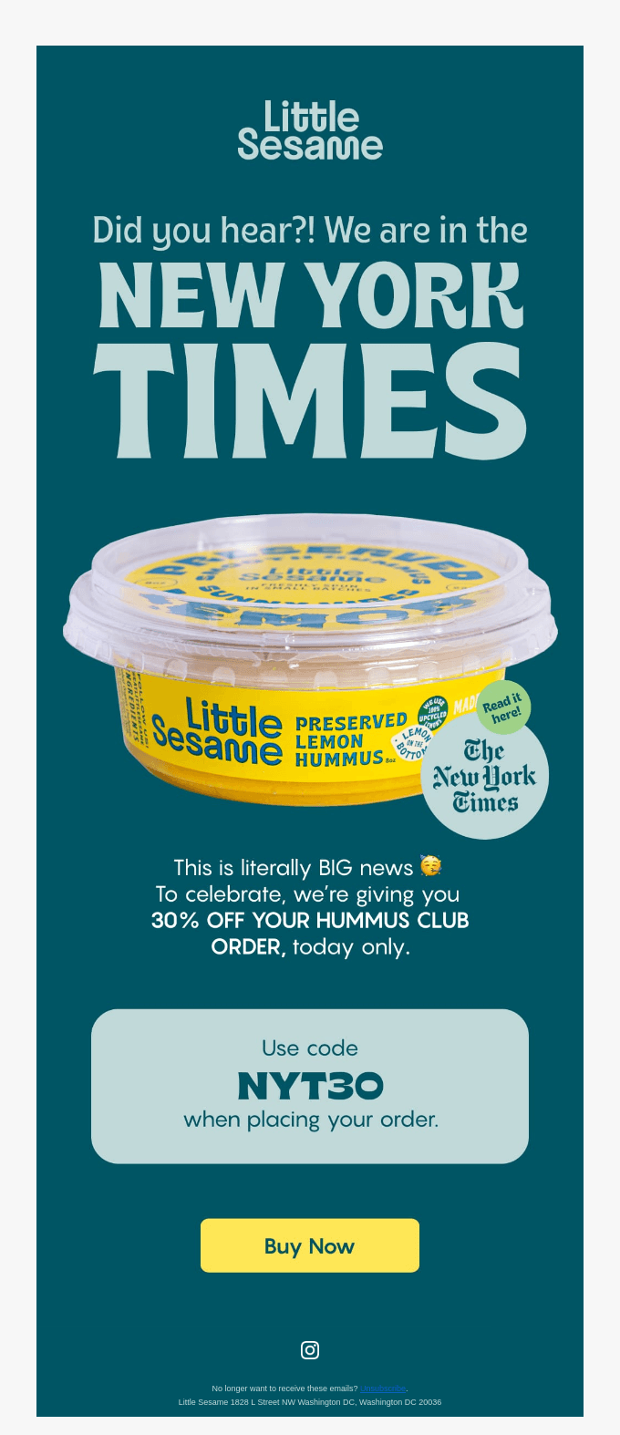
The same applies to colour; it can say much more than what is expressed in the logo. Saturated colours are back so that as soon as the subscriber opens the email, they get hooked. Simple aesthetics are not incompatible with the use of vibrant tones that provide a sense of diversity when converted into gradients. An example is the application of colour to QR codes to integrate them visually into the design.
Animation and interaction are another trend to bring life to email marketing campaigns. It could be adding a GIF in the header or using a carousel to navigate through images and choose the desired product. There are many possibilities to retain the subscriber longer within the email and thereby improve the reading time. It's about leveraging resources for the ultimate goal.
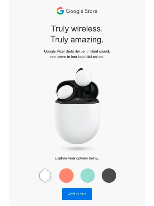
Regarding the overall style, retro is back. This translates into pixel graphics but also nostalgic effects, such as abstract patterns from the 90s that once seemed futuristic. This applies to icons as well as very colourful images, immediately capturing the attention of those who lived in that era. Nostalgia sells even when it comes to more distant eras leaning towards vintage, such as the 60s or 70s, as long as a connection with the brand is achieved.
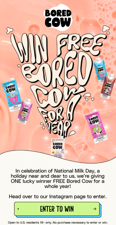
Younger individuals may prefer a flatter and more realistic design, which can be more elegant and blends well with the minimalism we mentioned earlier.
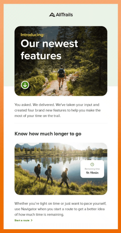
Adapting to customers is key to achieving results, so you can choose, for example, to present products with different images, with more realistic or nostalgic textures. Also in colours, such as Barbie pinks or the Peach Fuzz proposed by Pantone for 2024.
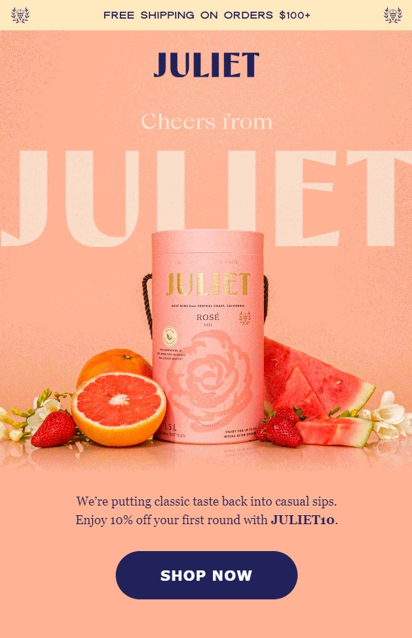
Finally, of course, artificial intelligence in email marketing will continue to evolve. It's an unstoppable trend that affects everyone online: images and text can be generated more easily and realistically than ever. This implies that there are no limits to telling stories—more striking and more focused on what you want to convey, but also more tailored to each type of user to achieve more impacts and better results.
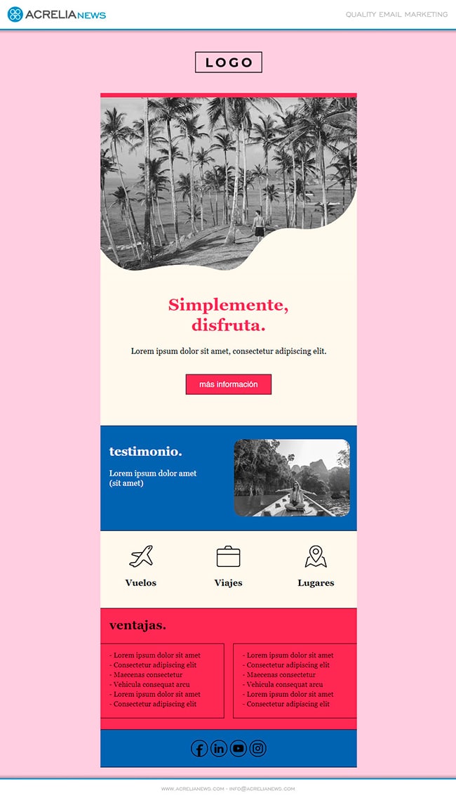
Applying all these trends, in Acrelia we have created a free email template that is available in our campaign editor.
Do not miss anything from our blog and join our Telegram https://t.me/acrelianews
Haven't you tried Acrelia News yet?
If you like this post, you will like much more our email marketing tool: professional, easy to use.