Category: Email Marketing

Typography is key in the design of email marketing campaigns because it is a reflection of the brand. A poor choice of font can jeopardise recognition by recipients and cause a bad impression, as well as affecting results. The size of titles and buttons is something to take into account, in addition to the typography to be readable by all subscribers and for that it is advisable to always use safe fonts.
There are several ways to classify fonts. The most common is whether or not they have a serif, for example to distinguish between Times New Roman and Arial, respectively, but you can also take into account where they are downloaded from. When we talk about online fonts, we can differentiate between those known as system fonts for each device and those that are hosted on an external server. Each one has its pros and cons:
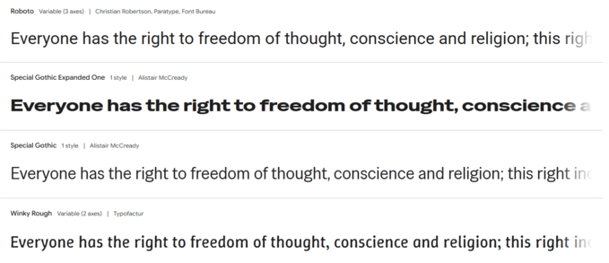
Source: https://fonts.google.com/
When designing a template, you can choose either or both of these options if you include an alternative font in anticipation of any difficulties in accessing them. The levels used by email readers are: custom font (usually a web font), fallback font and web safe font.
The process of choosing a corporate typeface should include its equivalence in all possible channels, also online for the web and email, as it is a branding decision and consistency should be maintained, at least in whether they are serif or sans serif and their spacing. To do so, it is necessary to assess not only strategic branding issues, but also user experience because not all devices and email managers work the same. For example, they may vary between Gmail on Windows and Apple Mail on IPhone.
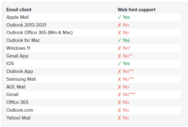
* ish? Some of the webfonts were showing up but it may be that the fonts were loaded on the computer
** Google overrides fonts – default on Android is Roboto, on iOS looks like Helvetica
*** Fonts overridden – Roboto is default sans-serif
**** ish. Liked Roboto, so there’s limited support of very specific web fonts – probably specific ones from Google Fonts, possibly only Roboto since it’s Google’s default
Source: Litmus
Always test to make sure that the design works well to ensure that the maximum number of recipients will be able to see it correctly. For example, changes in typography when having to use a replacement font can lead to texts varying in size, which can cause some sentence or paragraph alignments to become misaligned, especially in columns and bullets.
In addition, without using a secure base font for the template, buttons may also end up having a different width or be more difficult to read if the line spacing changes when a user's system font is applied rather than the original custom font. The same can happen with titles or phrases on a background image: they can be obscured or misaligned if care is not taken to ensure that all fonts in the template are as close as possible to the original.
Relying on safe fonts is a way to simplify the design, but small touches can be added to convey the right tone to the message, for example in newsletter banners or by combining fonts from the same family. In this way, a visually appealing corporate communication is achieved, which is undoubtedly relevant to attract the attention of the recipients.
When it is important that the typography is always the font of choice, you can use images with text and it will certainly look the way you want it to. But it would be a mistake if it becomes the dominant tone in the design as it would affect accessibility and deliverability because if there is only one image it could be considered spam and not reach the inbox, plus there would be users who would not see anything if they had the images blocked.
Do not miss anything from our blog and join our Telegram https://t.me/acrelianews
Haven't you tried Acrelia News yet?
If you like this post, you will like much more our email marketing tool: professional, easy to use.

Sign up to our newsletter
Last email marketing trends and news


 Tips and tricksE-BooksTrends and newsCase studiesInfographics


© Copyright 2025 Acrelia News | Terms of use | Cookies Policy | Legal notice | Privacy Policy