Category: Email Marketing tutorials

In informative newsletters, especially those that compile news or monthly events, there are many "Calls To Action" (CTA) and almost all of them are the same: "Read more", "Continue reading", "Share on social networks"... In promotional campaigns it's just the opposite: better results are achieved if you use a single button with a distinctive copy, designed specifically for each mailing.
Therefore, an effective CTA is different depending on the goal: loyalty campaigns, promotional campaigns, anniversary campaigns... All of them need a button that stands out. There is no button that always converts more than another, but it is possible to look at what those that get the most clicks have in common. This is what we have done to compile good practices that will increase your CTR.
When you are preparing your next call to action, ask yourself these questions:
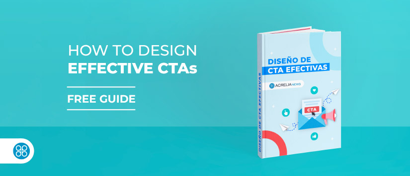
In our guide "Diseño de CTA efectivas" we address all these issues with some examples so that your next mailing gets more clicks.
Do not miss anything from our blog and join our Telegram https://t.me/acrelianews
Haven't you tried Acrelia News yet?
If you like this post, you will like much more our email marketing tool: professional, easy to use.