Category: Email Marketing

You have designed the email marketing strategy, created a valuable content for the user and segmented the recipients, so you can now send. Wait, not yet! First you have to make sure that everything is correct, lest you fall into the mistake of having linked the wrong call to action button or, worse, not having added any link.
In Acrelia News we recommend that you make a series of checks before sending anything because afterwards there will be little to do to remedy it: test the content, the design and review the configuration so that there are no errors that make you look bad in front of your audience and force you to rectify.
1. Test your content
1.1 Avoid spammer words
1.2 Check your links
1.3 Check that everything fits
2. Test the visuals
2.1 Preview the campaign in several ways
2.2 Check accessibility
2.3 Calculate the loading speed of images
2.4. Make sure it doesn't get cut off
3. Test everything
3.1 Review the subject line and preheader
3.2 Check the sender's details
3.3 Final review
The most basic check that can be made to the content is to avoid typos: just use the proofreader of your word processor (copy and paste the text of your campaign) or the browser if you have configured it that way. But there are other less obvious aspects that also influence the results of your email marketing.
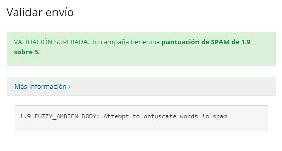
With the spam checker you can find out which words can potentially lead your message to the spam folder of your subscribers. To avoid anti-spam filters, change the words we mark as dangerous for a less conflicting synonym.

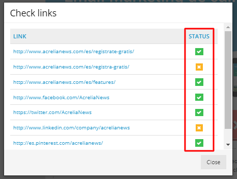
Open the link checker to check that they all lead to where they should and that there are no broken links, especially if you are reusing an old campaign. This is also a good time to confirm that the calls to action match the landing page and that they are completely unambiguous so as not to mislead the user.

When using content from your word processor, make sure it fits well in the campaign template: check if there are any words that stand alone in the last line of a column or if sentences can be shortened to fit better in the text block, for example.
The design is usually something that worries companies quite a lot because not all email managers (GMail, Outlook...) show the same message in the same way. That is why from the beginning it is advisable to work well on the template on which the campaigns will be based and to make the minimum modifications to its structure (header, columns...) in each mailing.
Although it is the easiest option, you should do it: while you are designing the campaign, check how your subscribers will see it. It allows you to verify that content changes (photos, text) do not spoil the template and that it still looks good on both desktop and mobile. Also, apply various filters to identify possible vision problems in colour-blind people.
If you create an accessible campaign, you ensure that all your subscribers see your mailings on equal terms. For example, be sure to include alternative texts on the images that describe them correctly. As well as helping visually impaired people understand your message, you will also check how users who have automatic image loading turned off will see it.
For more details, see our guide to accessibility in email marketing.
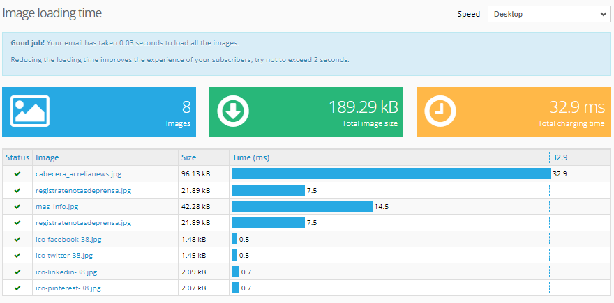
Whether you have one or several images, it is best to check how much they weigh individually and in total so that they do not spoil the user experience. If images are too heavy and the connection is too slow, they will take a long time to load. Even if it only takes two seconds, the perception is negative, so it's best to avoid this. Check the graph in our campaign editor and correct any that are too heavy, for example, by changing the size, resolution or extension.

Email managers such as GMail take into account the weight of the messages to trim them and not show all the content to subscribers. Not only does this make for a negative experience, but the statistics are distorted because they are not counted as opens. In the preview, look at the size of the campaign and make the necessary adjustments so that all users can see it in full.

Rushing can make us make mistakes that we would not make if we had spent a little more time, but it also prevents us from improving what we replicate in each message.
Try to improve the subject line by making the most of the space and avoiding repeating the same ones. Make the most of the pre-header with a text that encourages people to open the campaign and review how the emojis you have included look so that there are no misinterpretations.

Check the sender's name and email address to make sure they are the most appropriate for each mailing: they can affect your open rate.

To test the global configuration of the mailing, the best option is to send a preview to your mailbox or to a test list in which you only have colleagues. This way you can review the content and layout and configuration options.
All of these recommendations will take you a few extra minutes to prepare the campaign and you may not find them very useful. But once you get used to the routine of going through them, you will see that it is worth investing a little time in making sure your mailings are as perfect as possible.
Do not miss anything from our blog and join our Telegram https://t.me/acrelianews
Haven't you tried Acrelia News yet?
If you like this post, you will like much more our email marketing tool: professional, easy to use.