Category: Email Marketing

The visual component of an email marketing campaign is crucial for ensuring that recipients better have better understanding of its content. Images are a key element in making it more appealing and increasing the click-through rate. Therefore, they need to be carefully taken care of and optimized before uploading them to the campaign editor: you shouldn't use them in your emails as they are on your computer. We recommend that you follow these tips from our design team.
In email marketing, the ultimate goal of optimization is to control the file size of the entire campaign because if it is too large, it may not display properly, slowing down the reading experience, and affectting both deliverability and the sender's reputation. The result can be lower conversion rates and increasing of the unsubscribes.
To confirm that this is a good practice, we list the benefits of image optimization along with a list of several errors that can occur if this task is not done:
A more concrete example: using a single image for the entire campaign is a bad practice and demonstrates that it is not optimized, even if the image itself is, because if the user doesn't have the option to download them, they won't see anything. You need to maintain a good balance between images and text to avoid being considered spam, which is why photographs must also meet certain requirements.
There are many visual resources present in an email marketing template, such as fixed elements (header, section icon) or images that change (photos, illustrations). The former will already be optimized in the campaign editor, but for the latter, you will need to spend some time optimizing them.
The three factors that influence the weigh of the images are:
Some designers always use the same format to simplify file management, but it's not necessary. You can choose the most convenient format considering its usage. For example:
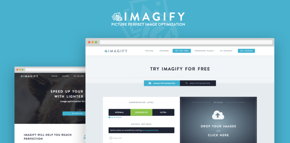
There are many free tools for image editing and conversion to make all these adjustments. One very easy-to-use tool is Imagify. With it, you can use three levels of compression and scale them to the desired size with a couple of clicks. This way, you can save valuable KB and make the message download faster.

Fuente: Imagify
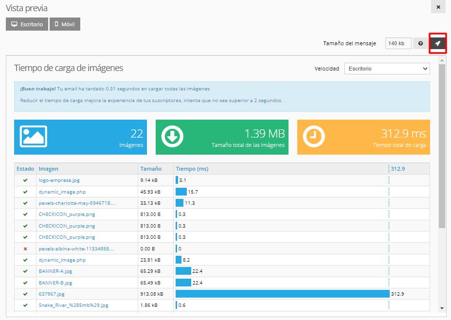
Keep in mind that the speed of each user's connection affects how quickly the images are shown. To ensure good loading speed, they should not exceed 100 KB. Acrelia's campaign editor will notify you when the loading time exceeds 2 seconds and provide a graph showing the total number of images, their size, and loading time. This way, you can quickly identify which images need to be corrected.

The recommendations from our design team go beyond image file size. Here are some of their considerations that also affect image optimization.
Using alternative text is a key optimization within each campaign. The ALT tag is used in HTML to describe an element such as an image. For example, if it's a product photo, use a short phrase instead of just the product name.
Adding ALT to images is a good accessibility practice in email marketing because it allows the content to be "read" by tools for people with visual impairments. It's also useful if the user has image downloading blocked because they'll be able to know what they're missing and activate this functionality.
Optimizing a product photo requires different decisions than optimizing a graphic or a simple icon. If the user views the message on a computer, there will be little difference. However, if they do so from a mobile device, you need to consider that the width will be reduced, and it may make it difficult to read any text within the image.
To check this, test: preview the campaign from our editor or send yourself a test and open it from different email clients and devices.
Take advantage of the folder system from the beginning to keep different types of files organized for each email send. Use one or two descriptive words, a number, or a date. For example: /newsletter/2023
Although file names may not always be visible to the user, it's useful to quickly identify images for reuse or to avoid overwriting them in the next campaign.
In both cases, whether it's folders or their files, to avoid spam filters, avoid using special characters or words that could be considered spam triggers (free, offer, marketing, etc.).
Do not miss anything from our blog and join our Telegram https://t.me/acrelianews
Haven't you tried Acrelia News yet?
If you like this post, you will like much more our email marketing tool: professional, easy to use.