Category: Email Marketing

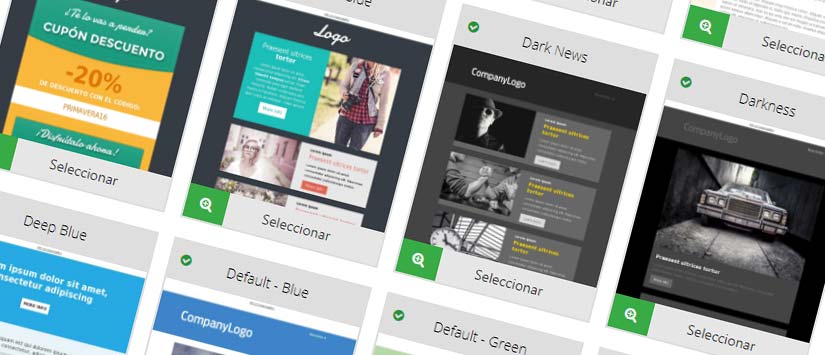
When you start in email marketing, one of the big questions to solve is wich template should our newsletter have. A Google search for campaign designs returns endless possibilities. Choosing the best is a task that is repeated in each sending because it does not have to be the same always. Today we give you some tips to make a good decision.
The best way to choose your template is to take into account its goal. What do you want the subscriber to do or why should sign up for your messages? There are many possible objectives and each one will require a different design that helps to achieve them. Some examples:
Although all these goals are the main ones, we must not forget that any of them can benefit from the fact that the newsletter is shared in social networks so the template must also include the buttons for it. It can be to share every news or offer, or campaign in general. In addition, the icons to follow you in social media are another way to cross the email client borderso that the subscribers go to your profiles and discover more of your business.
As we said at the beginning, it is not necessary that all the campaigns that you send have the same template. You can change it according to the objectives you pursue, but you must always respect your corporate identity: any design can be customized with your colors so that the image that the subscriber takes is always consistent with your brand. This is not only achieved with the sender, but also with the different content elements. For example, that the buttons are always red to contrast with the background or that the header image includes a reference to your field, in addition to the company logo.
One last point of obligatory comlience: your template has to be adaptive. All Acrelia News' templates are, but it's worth remembering that if you do not make your mailings responsive, you'll be losing more and more volume of opportunities with subscribers who check your sendings from mobile devices.
Do not miss anything from our blog and join our Telegram https://t.me/acrelianews
Haven't you tried Acrelia News yet?
If you like this post, you will like much more our email marketing tool: professional, easy to use.