Category: Email Marketing

The most general way to apply usability to email is to make sure that your mailings are easy to understand for all users, for example with unambiguous text so that they can complete their objective without any problems. You may already do this because it is the basics, but there is much more to it.
Jakob Nielsen, known as the father of usability, defined 10 heuristics, principles or rules for interface design to provide a good user experience. And they can also be applied to the different messages you send to your database.
Just as in an online shop you show the remaining steps in the checkout process, you can also include the previous and next interactions in transactional mails. In this way, the user always knows how far they have come and how far they still have to go to achieve their goal.
Although artificial intelligence continues to advance, many automated messages still appear to be written by machines. This makes it difficult for the user to easily understand what is being said or asked to them. Therefore, try to use a style that is close, natural and similar to that which would be used in a conversation between people.
In email marketing, the emergency exit is the unsubscribe form. Don't hide it: the user has the power to choose what to do, even to make mistakes and sign up for your newsletter and regret it. Let them go, give them freedom of movement and, by the way, comply with the GDPR.
This principle can be applied to both your brand and the structure of your newsletter. On the one hand, always use the same tone and be consistent with your corporate identity. On the other hand, respect what everyone already knows, such as that there is a browser version in the header and that unsubscribe information is in the footer.
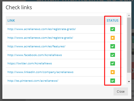
Test, test, and test. This is a good practice that you should follow for all types of campaigns. Check everything: the content to avoid spammer words and misspellings, the links to avoid losing conversions, the template to ensure that it is not clipped and that it is accessible and, of course, the header information.

Related to the consistency point, it is important that message recipients know who is sending them what. It is good to remind them of the brand either on the sender or the subject line, but they also need to be able to recognise it from the content they read, as we said before, both by design and by brand style.
The hierarchy we establish for displaying information is key to avoid users having to scroll to find what they are really interested in. Another option is to take advantage of dynamic content or offer the possibility for the user to choose which communications they want to receive, including the frequency of sending.

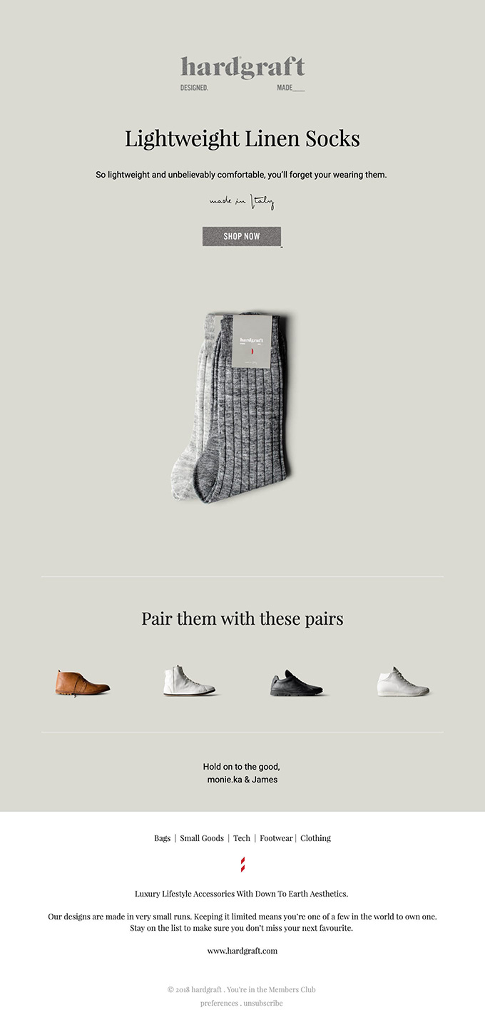
Focusing on the essentials can be applied to content, although it is especially relevant in the choice of template because visual elements should not distract the recipient from their main objective. In a minimalist design, for example, texts are reduced, colours are simplified and white space is prioritised.

Tests should prevent us from sending errors, but to apply this principle to email marketing, we can think of communications that correct them. In our guide "When and how to apologise by email" you will discover that there are times when it is necessary to apologise and how to do it so that the impact is less.

This last rule is very specific to interfaces, although providing user support is also a good practice in online shops or registration pages. In addition to ensuring a good customer experience during the visit, you can incorporate email as a support channel, for example with onboarding.
Do not miss anything from our blog and join our Telegram https://t.me/acrelianews
Haven't you tried Acrelia News yet?
If you like this post, you will like much more our email marketing tool: professional, easy to use.