Category: Email Marketing Trends
One of the design trends in email marketing 2024 is that retro is making a comeback. Nostalgia is an emotion that allows us to connect positively with the audience because it creates a shared moment with customers and subscribers. A campaign of this style may come as a surprise, although it doesn't seem so strange anymore because retro is becoming more and more present in our lives. It may be because the product is the one that reminds us of another era or because the whole message has a touch of the past.
Yes, there are products recovered from the past and with current design that have been created for the delight of nostalgic beings. Then, the communication is similar to what would be done for a new product, with the difference that here it makes much more sense to tell the user that "it is what he was waiting for" because, possibly unconsciously, he was doing it.
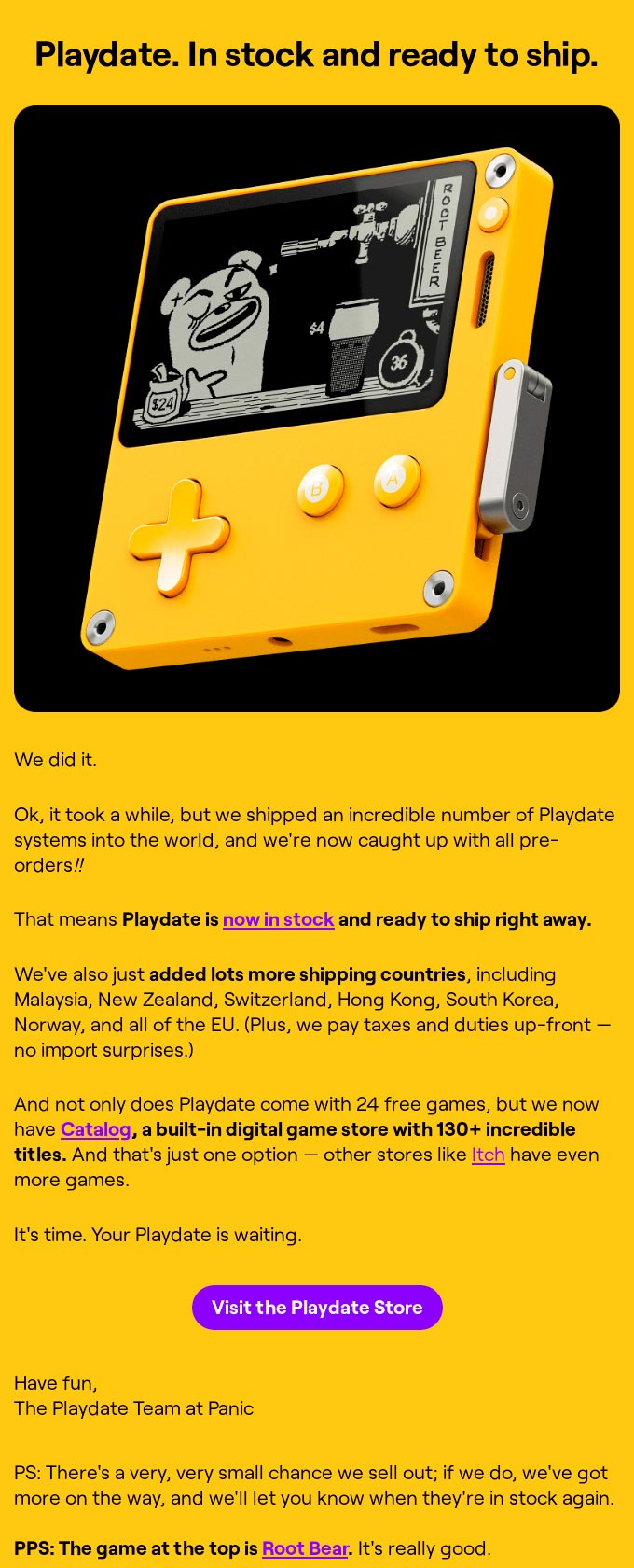
Source: Really Good Emails
Any product can bring back what made it popular a few decades ago. This business decision can be accompanied by a new design for email marketing to showcase or reinforce those distinctive elements that have made it a classic. For example, with a header image that combines old and new in the look of the models.
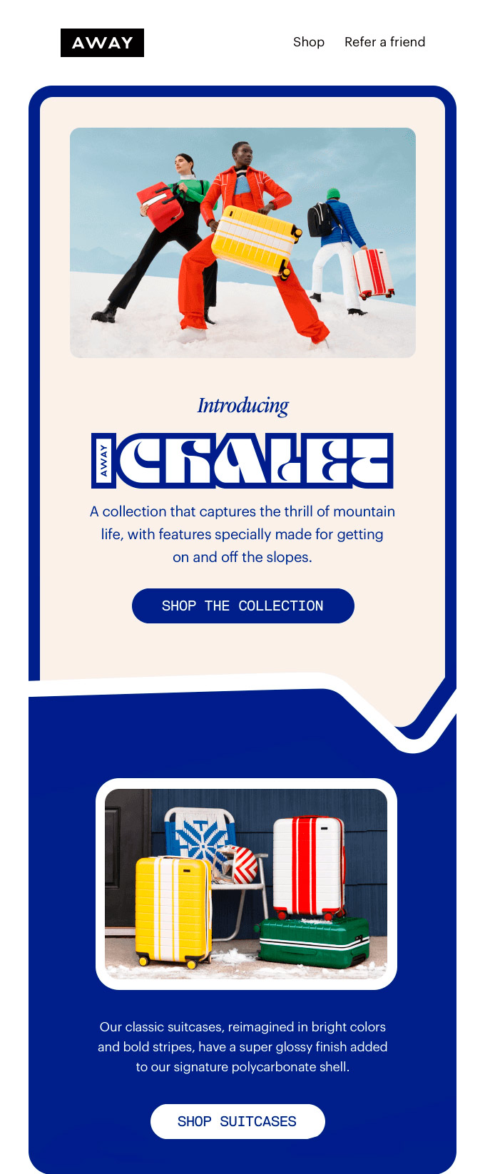
Source: Really Good Emails
Another way for retro to feature in an email marketing campaign is to promote some aspect of a product that brings back nostalgia. It may be by bringing back the style of a few decades ago to current templates. In these cases, the actual design of the message does not have to be retro-looking because it would not be the brand's usual thing to do.
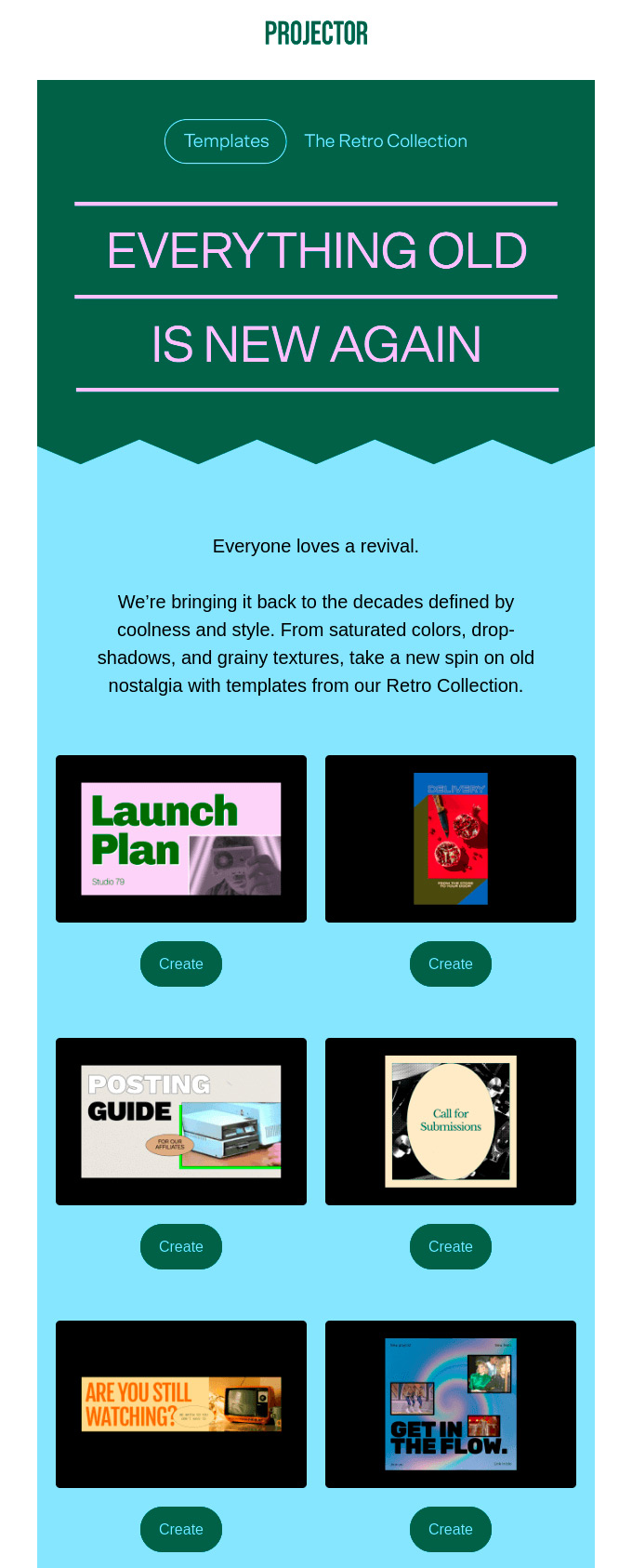
Source: Really Good Emails
The quality of photographs is no longer spoilt by resizing them, and using one without a transparent background is considered a mistake that spoils the design. Inserting an image with pixels and a white background could be a disaster, if it were not in a campaign that exudes retro from the first moment. If, in addition, it coincides with a Cyber Monday offer, the wink is more than justified.
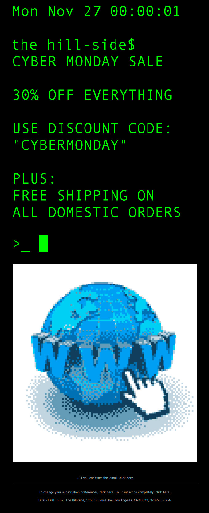
Source: Really Good Emails
If nowadays it is unusual to find pixelated images, it is also unusual for typographies to be able to distinguish all the corners that form them. Pixel fonts are the opposite of handwritten fonts and give the design a retro look. Even more so if it is a text-only message with just a rather old-fashioned hourglass icon.

Source: Really Good Emails
Some generations may never have seen a dot-matrix printer, others will have started to hear in their minds what they sounded like as soon as they read their name. That memory is a powerful one, and receiving a message written as if it had been printed on that machine is sure to get more than a smile... while for others it will be just a curiosity, nothing more.
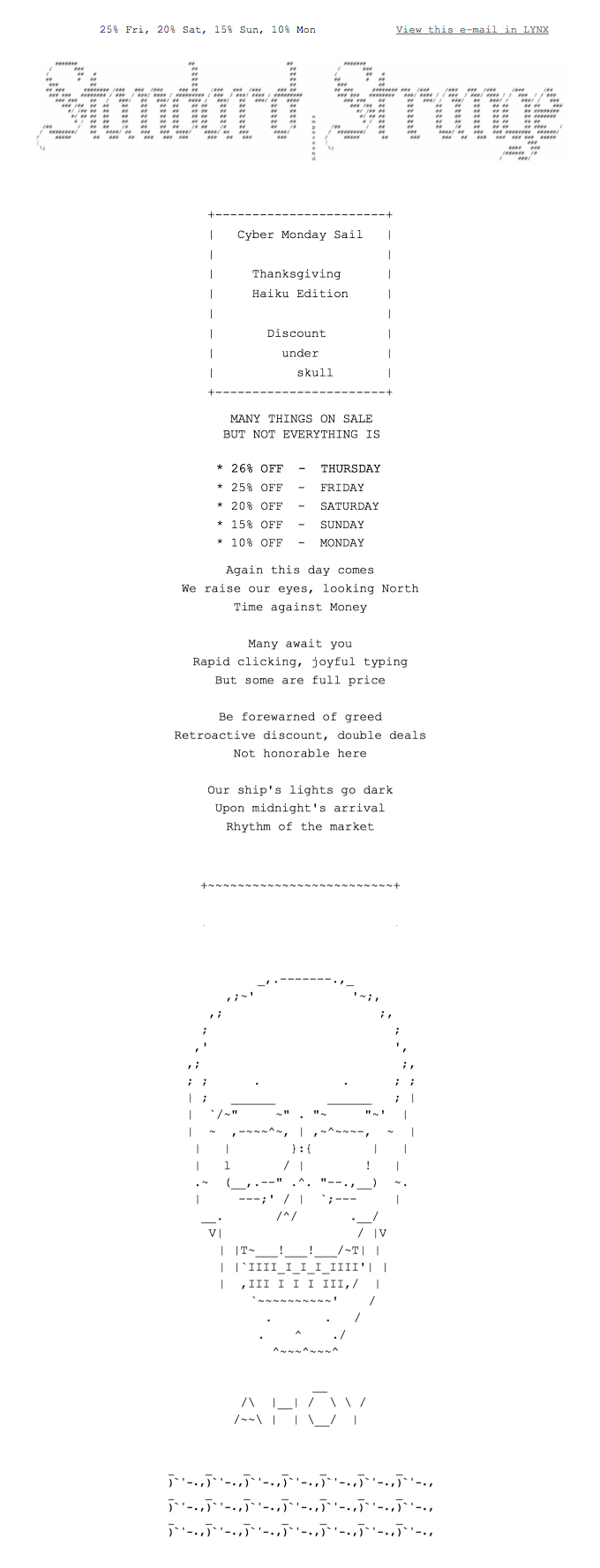
Source: Really Good Emails
Every company has a different corporate stationery, not only because of the logo, but also because of how they use the header to include basic information in reports and memos. Bringing this style to a newsletter is retro and perfect for companies that dare to put a picture of an old computer or a coupon to cut out that looks like something out of a paper magazine.
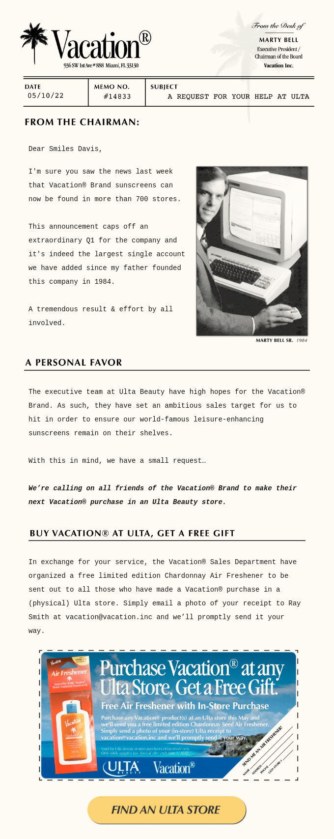
Source: Really Good Emails
The combination of colours, the shape of the buttons or the layout of the sections, there are several elements that indicate that a template has something from another era. It is best if it is because the brand is also like that, although it can be used for a specific campaign in which it is interesting to reinforce a more traditional value, even if it is from a few decades ago.
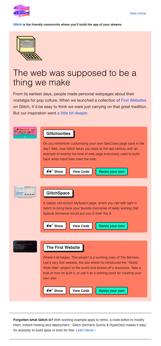
Source: Really Good Emails
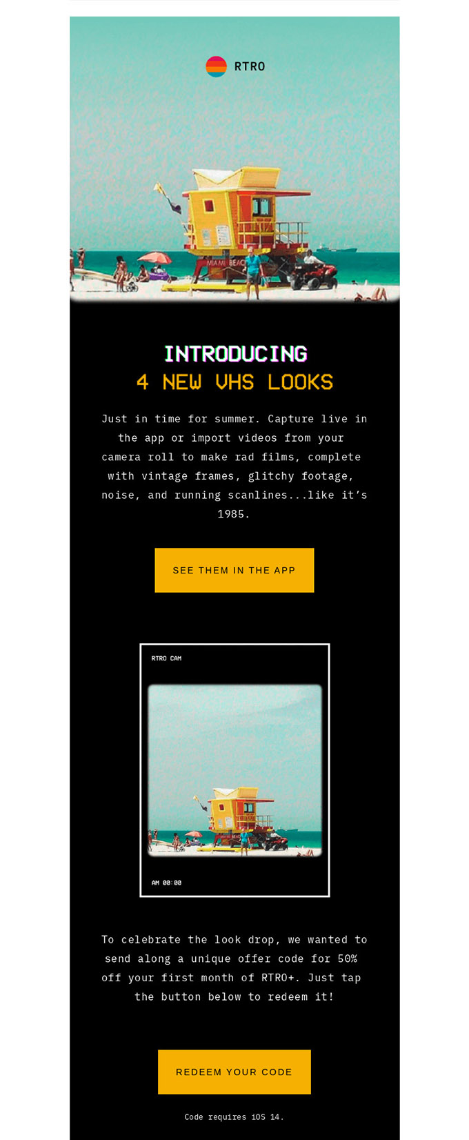
In an email marketing campaign, it is possible to use words that someone might say are outdated, such as "VHS", and get clicks. Retro may rank in search engines, but it certainly does so in the mind of the user who connects with that word and brings back nice memories that, from now on, can be associated with the sending brand.
Source: Really Good Emails
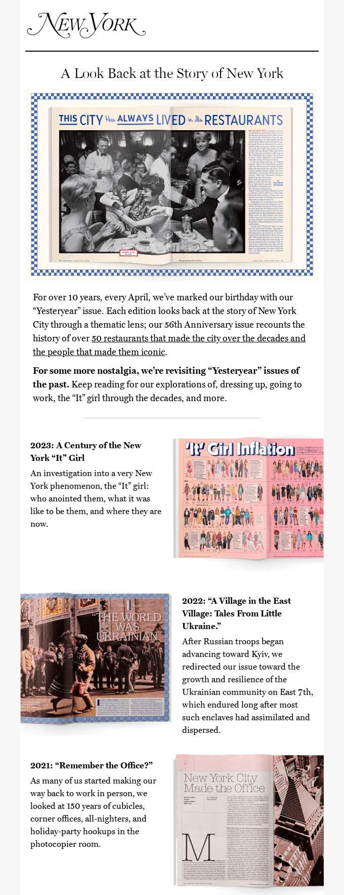
Explaining the history of the company can be done by anyone, although the older it is, the easier it is to give the result a retro look. However, nostalgia is sure to be awakened in more than one subscriber if you choose well the milestones you want to tell. And with the right typography and a good selection of images, you can even get a tear in the eye!
Source: Really Good Emails
Do not miss anything from our blog and join our Telegram https://t.me/acrelianews
Haven't you tried Acrelia News yet?
If you like this post, you will like much more our email marketing tool: professional, easy to use.