Category: Email Marketing
The header of a newsletter is the block of content that precedes the body of the message. Its main element is usually the logo of the company or, in the case of promotional mailings, the main product being advertised.
In newsletters, the easiest thing to do is to keep these visual references and be consistent so that it is easy to associate different emails to the same company. However, there are many other possibilities to get a little more out of your header, such as the ones explained below.
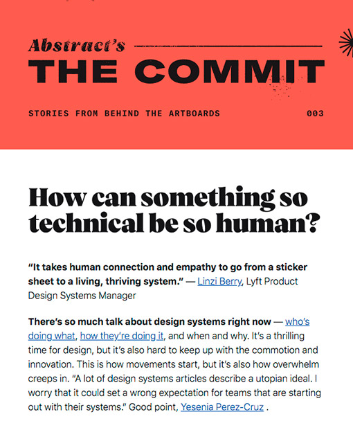
If your newsletter is an important pillar in your email marketing strategy, you should design a header that conveys its value proposition. Even if it follows the corporate identity in terms of typography and colours, it can have its own name and visual references, such as a logo or a specific image. This way, it can be understood that it is under the brand umbrella but serves as a complement.
Source: Really Good Emails
In this example, just below the image of the newsletter logo, the same background colour is used to insert a sentence and the mailing number that identifies the communication. In this way, the header combines information common to all the editions and information only for this one.
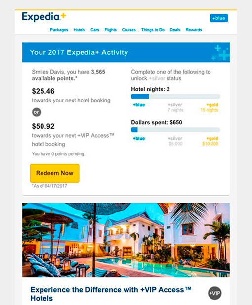
If the footer of a newsletter can be converted into a navigation menu, it is also possible in email headers. Since it is a way of imitating the corporate website, it is convenient to follow, not only the same colour but also the same labels for the sections to be linked. Keep in mind that perhaps not all of them will fit, nor create submenus, so you will have to choose which ones the user might need to use considering the type of sending that is being done.
Source: Really Good Emails
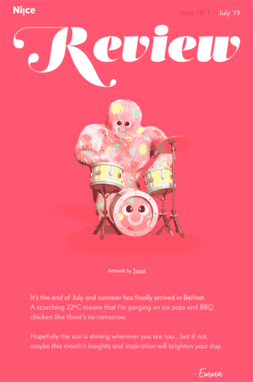
Unlike those that are always the same or only vary to add the sending date, it is also possible to design a newsletter with customised headers to capture attention in a way that makes clear its relationship with the content that is being sent.
Source: Really Good Emails
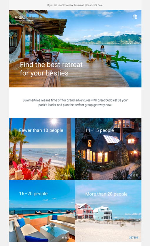
This option is perhaps the most time-consuming, as you have to add the design of the header to the selection and writing of the information. For this reason, another simpler possibility is to use one of the images of the news that is being shared to highlight it. This makes it clear how it relates to the subject line that the user has read in the inbox.
Source: Really Good Emails
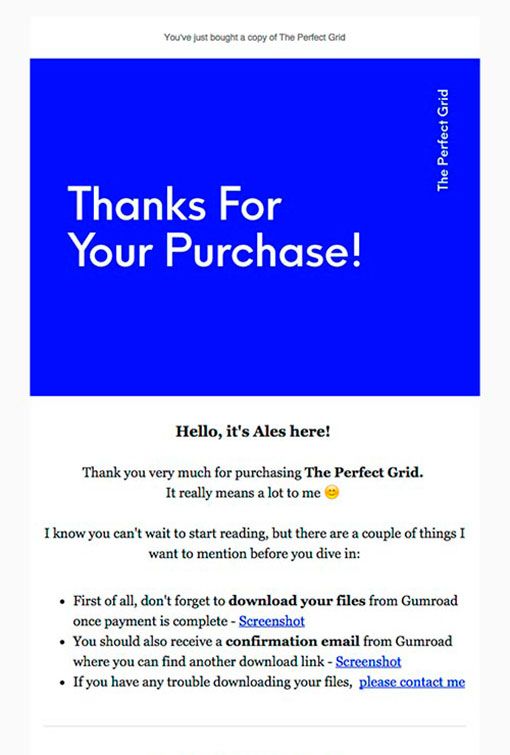
The size of the header can vary depending on the type of message that is sent, they do not always have to be large or small. The ones we have seen so far are suitable for any newsletter, but there are other communications that are also commonly used and in which you can adapt their design. One of them is the subscription confirmation that can visually mimic the purchase confirmation.
Source: Really Good Emails
It is simply a way of saying thank you for the trust, for example with a header that takes up a large part of the user's screen (underneath there is already space for other explanations). This size might be excessive at other times, but here it is justified.
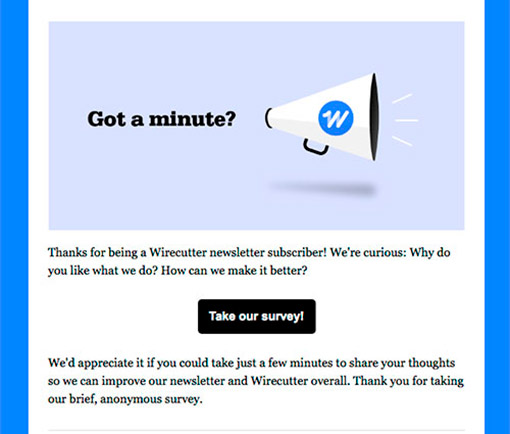
Whether it is once a year or when you need to complete profiles, if you conduct a survey among your subscribers it is also worth having a different header because you will make a specific email marketing campaign for this purpose. This way you can reinforce the idea that it won't take a lot of time, that you are interested in their opinion to improve or what benefits it has for them to complete it.
Source: Really Good Emails
However, remember that there may be subscribers who have blocked images, so don't forget to add an alternative text and mention your intentions in the copy.
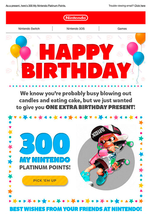
There are special moments when it is justified to use a different header from the rest of the mailings. One of them is undoubtedly the subscriber's anniversary, but it can also be the company's anniversary, an international day linked to the sector or any other date that is celebrated with a more cheerful message than an informative or commercial one. Or when you offer exclusive content that is only for top customers.
Source: Really Good Emails
In this example you can see how the design is very reminiscent of a landing page: logo, menu, header image and content with a call to action. In this way, brand consistency is maintained across all channels, including social media, which is key for companies with a high volume of communications.
Let's finish our selection of newsletter headers with what is arguably the minimum that can be included in it: a logo. And that's it. It may sound strange after everything we have been talking about, but we must admit that it is the easiest thing to do in situations where an online shop wants to send a quick notification or confirmation related to their products or services. It's a way of not lengthening the message unnecessarily, getting straight to the point.
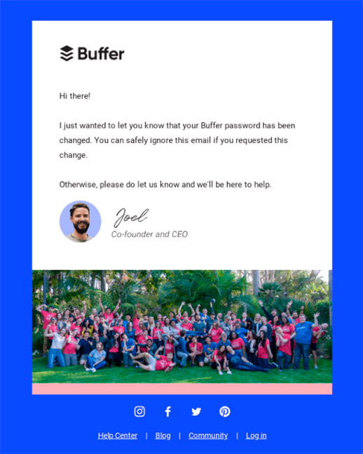
Source: Really Good Emails
Is it possible to send a newsletter without a header? This is not the option we recommend, but yes, it can be done. Then, instead of drawing attention to the image, what matters is the text. Therefore, the result can look like a letter, something very practical in text-only messages that have to communicate something legal as in this example.
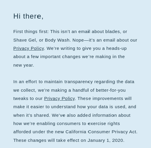
Source: Really Good Emails
There are many possibilities to create a header adapted to each message, leaving it blank is a missed opportunity to not include at least the logo, as we have just seen, and thus at least leave a visual record of who the sender is.
Remember that with Acrelia's block setting feature, you can avoid mistakes in your headers
Do not miss anything from our blog and join our Telegram https://t.me/acrelianews
Haven't you tried Acrelia News yet?
If you like this post, you will like much more our email marketing tool: professional, easy to use.