Category: Email Marketing Trends
Illustrations are as versatile as photographs. They can be large enough to take up the entire campaign or small enough to simply decorate. Whether they are designed to personalise the message or include a stock element, illustrations are useful to facilitate the understanding of a concept and making the product shine. They offer many possibilities for use in promotional campaigns where they help define brand identity.
Illustrations allow you to maintain the same style throughout the campaign, which is interesting in welcome messages because it gives the new subscriber or customer a clear idea of what the company's personality is. This can be in the header or in any other element included in the message, such as the typography, which can also be handwritten to contribute to the feeling of closeness that a first communication requires.

Source: Really Good EmailS
Illustrations cover many styles, both highly realistic and completely made up. Finding the balance that fits the brand is important, as is the combination with product images. For example, small elements can be included to complement a photograph to make the result unique.
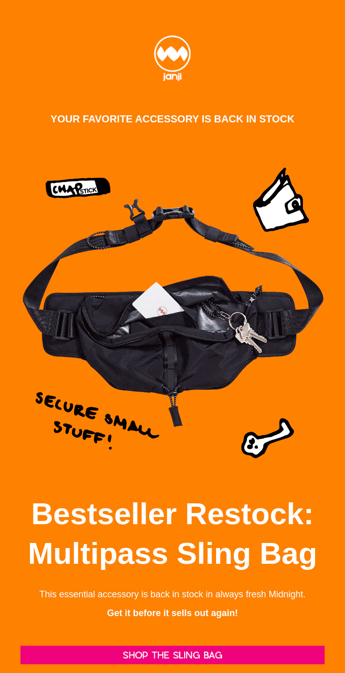
Source: Really Good EmailS
When the illustration is part of the brand, email marketing can include it naturally in the header or as a promotional image. If the packaging already shows a drawing, it is much easier to transfer it to the campaigns than when it is an intangible service. If, in addition, the product is part of the illustration, then brand recognition is more than assured.
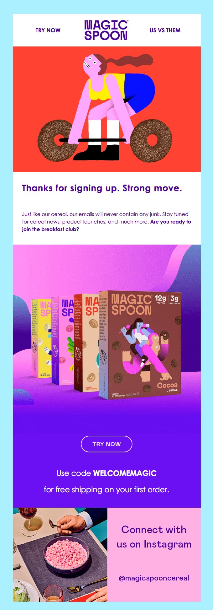
Source: Really Good EmailS
Illustrating a story is also possible when sent in an email marketing campaign. The integration of the text with the pictures is key to make the reading flow smoothly and get to the end. When designing the message, it is important to remember that it is not good practice to send a single image, so it is better if it can be chopped up to balance the illustration and the copy.
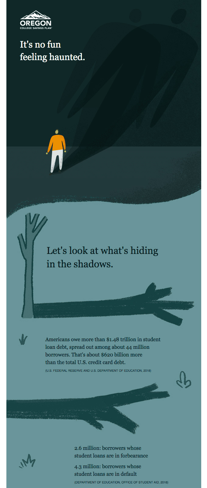
Source: Really Good EmailS
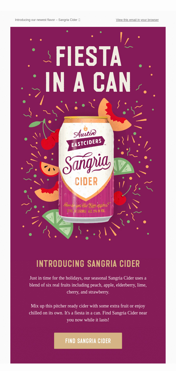
There are times when a photo is not enough to highlight some aspect of the product. Placing it on an illustrated background can make it shine in the message by making it more interesting or explaining a functionality that is not defined on the packaging. For example, showing the ingredients of a drink behind a can makes them stand out visually much more than if they were only in the text.
Source: Really Good EmailS
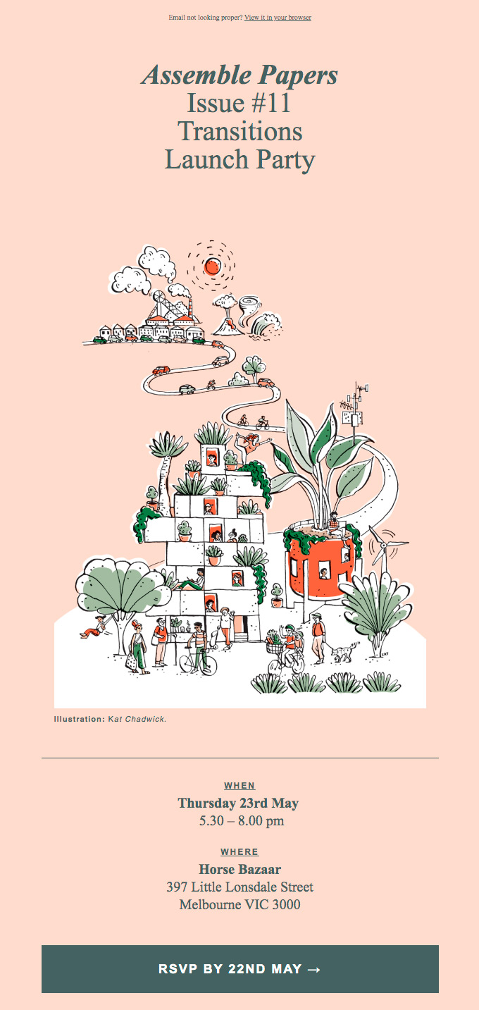
An event can also be promoted with an illustration. The most common resource is a photo of the keynote speaker, but the poster can be a drawing and use it as a campaign image or create one to send by email. As in the rest of the messages, it is necessary to take care of accessibility and include a descriptive ALT tag also for people who have blocked images.
Source: Really Good EmailS
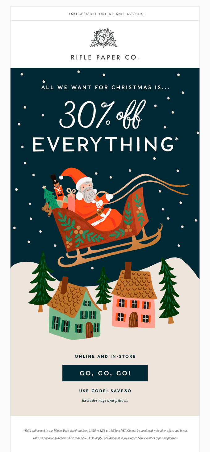
Even brands that prefer images may find that there are none of what they want to represent. They can turn to AI or create illustrations that represent that invented world. For example, Halloween campaigns or Christmas greetings are situations where a graphic design can be more appealing than a photograph.
Source: Really Good EmailS
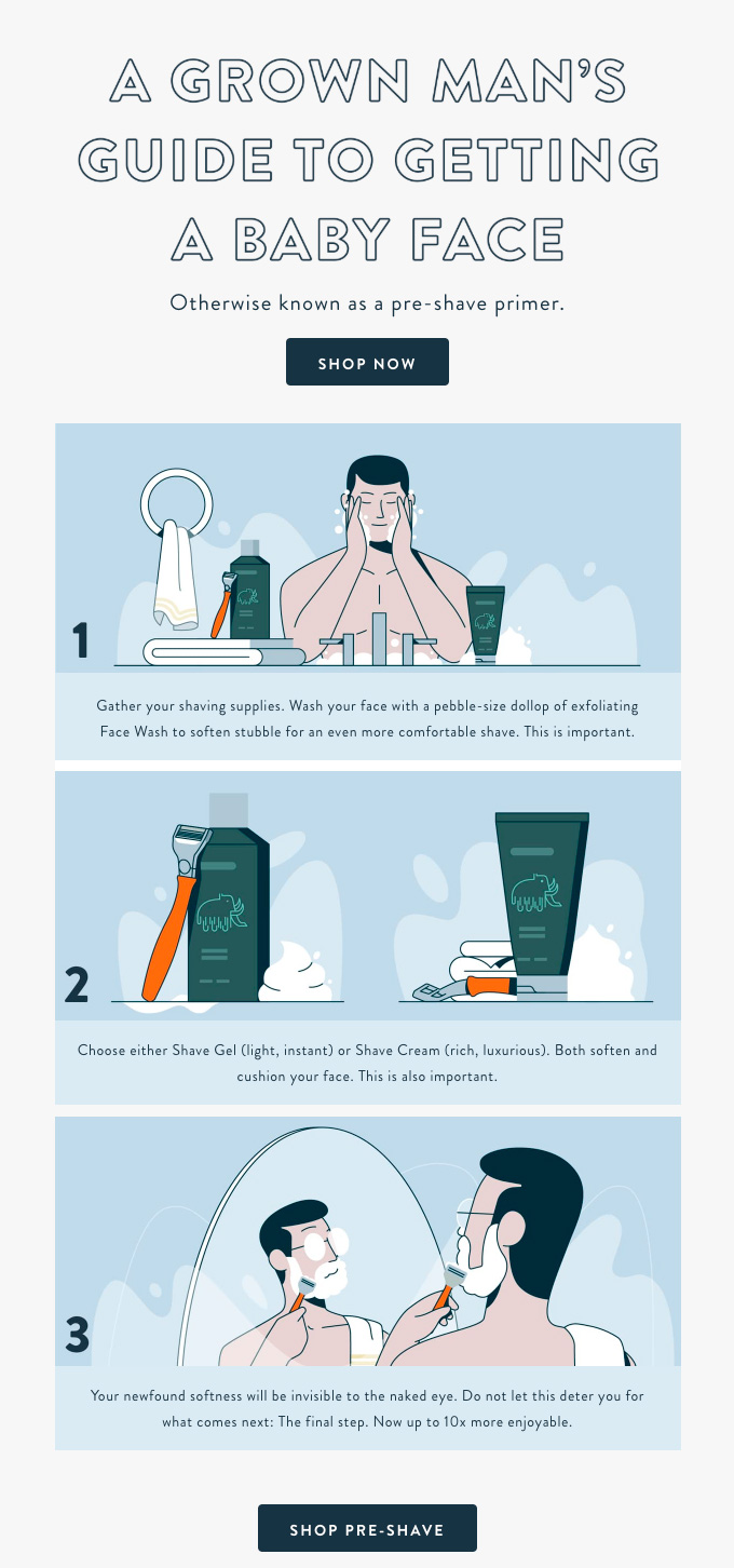
Finding the right model can be difficult. In contrast, in an illustration it is easier to cover different profiles. It also establishes a convention whereby some elements are not important and others stand out much more, for example due to the use of colour. When you illustrate a step-by-step, you can create brand-relevant details that would be more difficult to show with a photo.
Source: Really Good EmailS
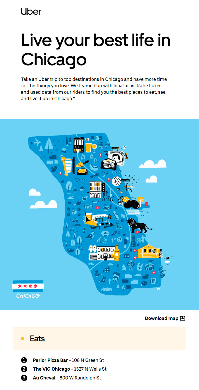
For tourism-related businesses, creating an illustrated map of a neighbourhood, city or country is very useful to show services offered or recommended. Using a realistic one would be appropriate for official maps, while decorating it with a corporate style and colours gives the feeling of being practical and close to what visitors of a certain profile want.
Source: Really Good EmailS
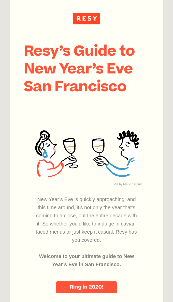
Illustrations may be created expressly by the company's design department or they may be provided in exchange for crediting the source. In these cases, the licence must be respected and the artist's name must be placed next to the work. In frequent collaborations or when the style fits well with the brand, an exclusivity agreement can be reached.
Source: Really Good EmailS
Do not miss anything from our blog and join our Telegram https://t.me/acrelianews
Haven't you tried Acrelia News yet?
If you like this post, you will like much more our email marketing tool: professional, easy to use.