Category: Email Marketing
In email marketing, the footer is perhaps the least considered element when designing a campaign. Yes, it is present in all the templates, but do you use it for something more than just complying with the law? Have you modified it to make your mailings look like your corporate website?
Let's review some examples of what to include in the footer of your newsletters to encourage you to see this last part of your messages as an opportunity. Check them out and take advantage of Acrelia's functionality to set blocks so that the old ones are no longer used.
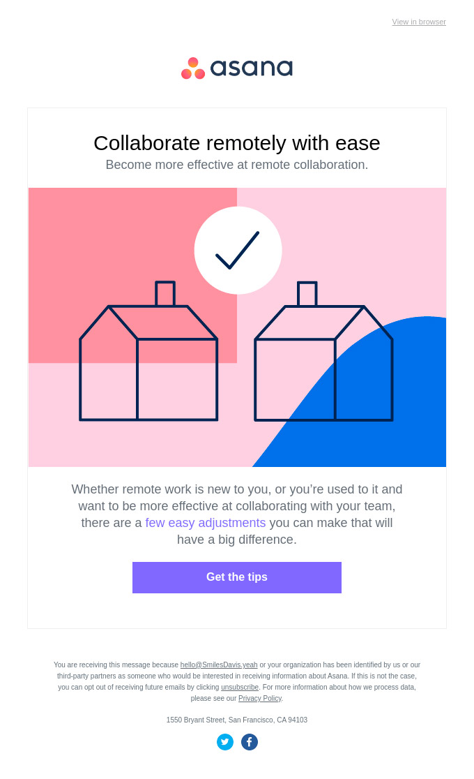
The footer of the email is where the legal information of the communications is included, so it is not something that users pay much attention to unless they really want to know why they are receiving this message, the privacy policy, how to change your data or unsubscribe.
A couple of lines is usually enough to show the relevant navigation links and contact details.
Source: Really Good Emails
If necessary, the footer is also a good place to include the details of a promotion, the copyright of the images used or the explanation behind an asterisk, such as deadlines for an offer.
![]()
Source: Really Good Emails
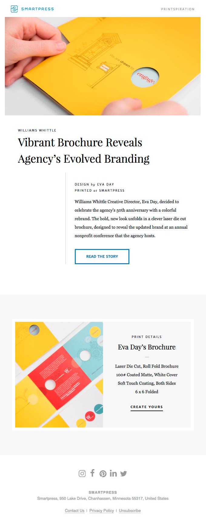
Social media icons can be used in a newsletter in two ways: to share the newsletter or to gain new followers. If you want to include both options, separate them so the user doesn't get confused. The footer fulfils this function very well, in a similar way to a website, because it allows the icons to be displayed in more subtle colours.
Source: Really Good Emails
Remember that Acrelia's campaign editor makes it easy: you just have to add the social networks' block and customise the links to the profiles you want to display. This way you will always have it available to replicate it in future mailings.
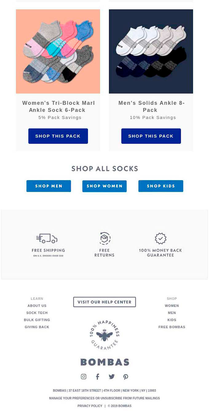
Legal information is not the only information that is usually displayed in the footer of an online shop, so why do you want to limit the email marketing version? Newsletters can also include direct links to the main sections of the website so that they are visually similar.
Source: Really Good Emails
To properly use this design, it is best to use two or three columns to distribute the links in an organised way, for example on one side those related to help and contact and, on the other, a simplified web menu.
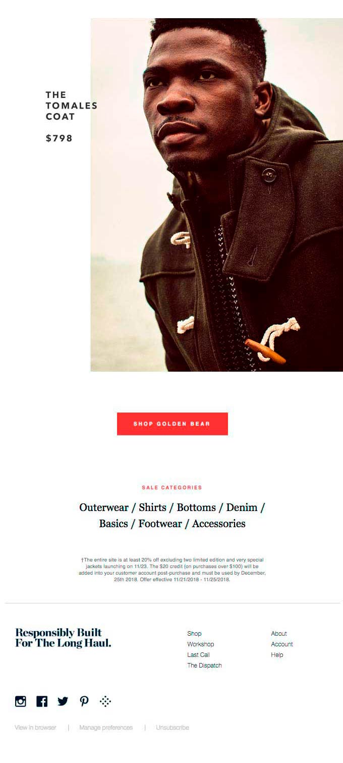
Source: Really Good Emails
It is possible that the imitation of the web becomes more evident if the same corporate colours are used for links and social networks' blocks and the legal notice is left a little aside. The graphic designer will have the option to choose!
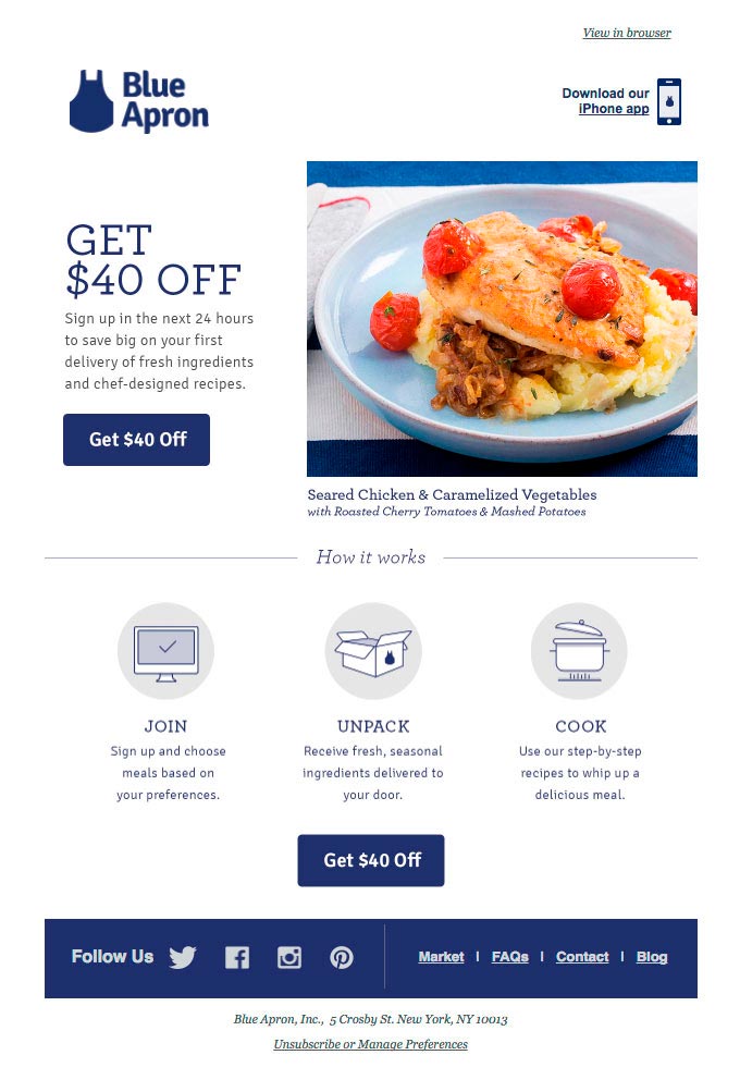
Source: Really Good Emails
We have said that few people read the footer, but, when it happens, do not miss the opportunity to communicate something that may be of their interest and even use a call to action. Some options could be that you are hiring, the support channels, suggesting downloading the app, reinforcing the value proposition or resources for an exceptional situation.
It is also a good opportunity to ask if they liked the submission and let them rate it, for example by adding links to emojis that they only have to click on to register their vote. Like social media icons, it only makes sense to have them at the end of the newsletter, so the footer (or just before it) is a good place to put them.
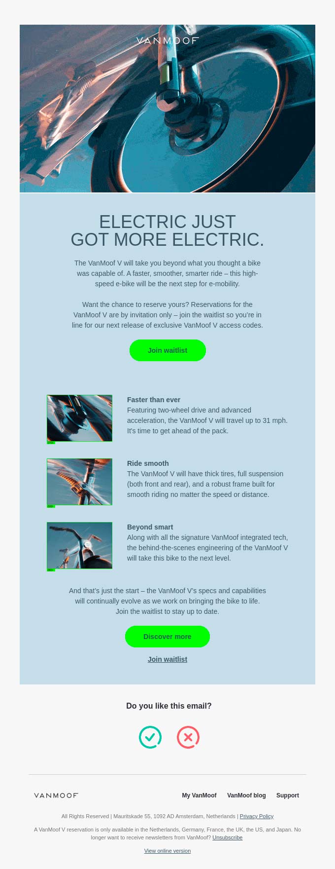
Source: Really Good Emails
When all your communication has a style that defines you and only you, you have to take care of the details and that includes the footer of your messages. You can insert a comment just to give it a personal touch or write a footer away from the legal jargon that is usually found in them.
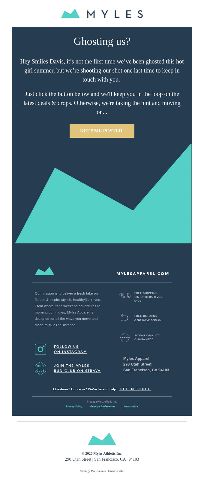
Source: Really Good Emails
Keep in mind that someone reading the footer text is expecting a certain type of information, but you can still turn that negative moment (they'll be looking at how to unsubscribe or complain) into a more positive one.
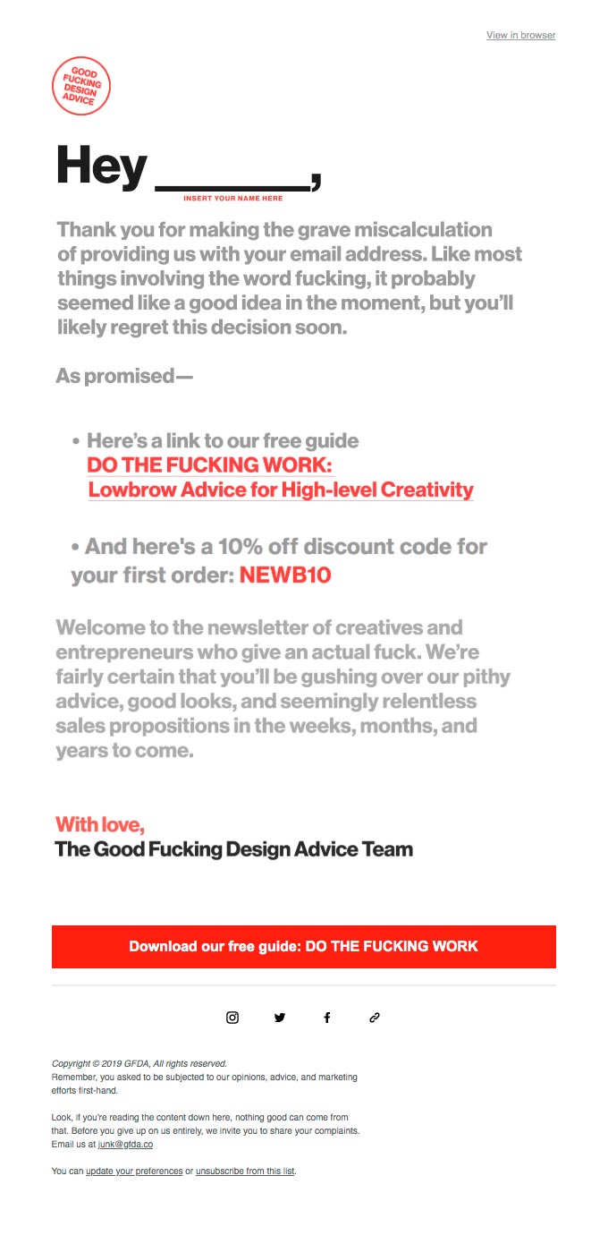
Source: Really Good Emails
Leaving aside what to include in the footer content, the way it is presented also deserves some examples.
The most common thing is to separate it visually from the rest of the message, both by the background colour and the typography, usually smaller.
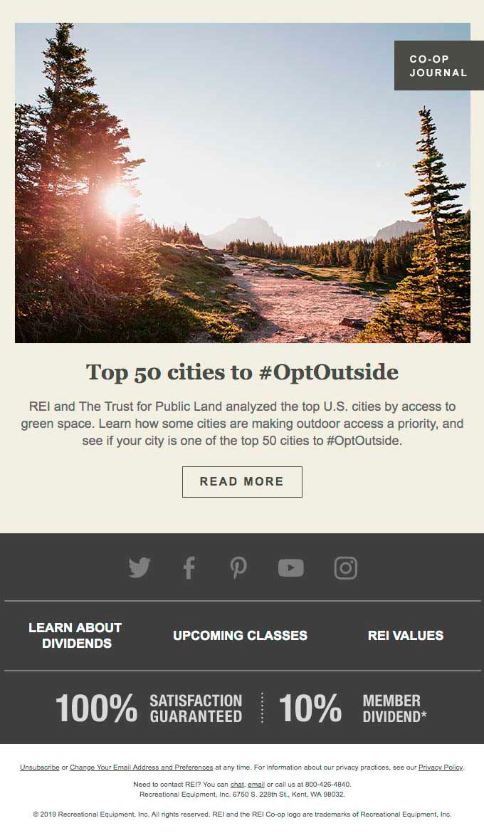
Source: Really Good Emails
However, it is possible to try to include it in the design in a more subtle way, for example by keeping the font and the distribution of the links, which is very practical if you want to integrate it with the design of the signature. This makes it easier to read as it feels like you are continuing from the previous section rather than cutting completely away from the rest of the newsletter.
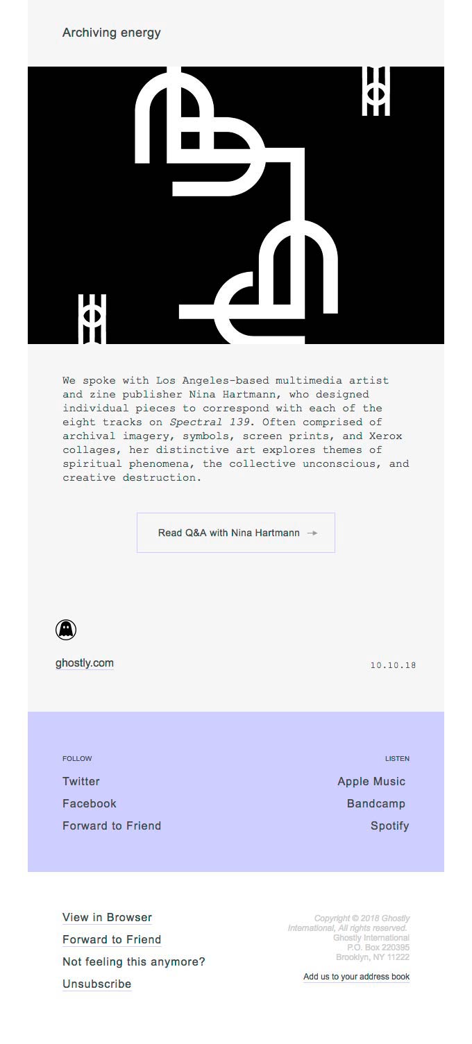
Source: Really Good Emails
How do you make the users notice the footer, even if it doesn't include relevant information? By using a design that surprises them. A good option is to make it longer than expected, for example with an image that accompanies the objective of the email or that leaves some space at the end of the email.
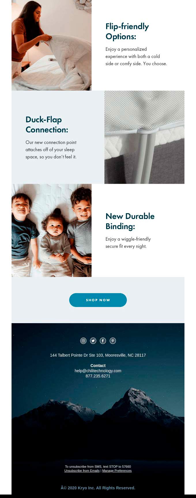
Source: Really Good Emails
To finish we will see the example of the most complete newsletter footer, that is, the one that includes a series of elements that make it "all in one": from links to social networks and to downloading the app to the physical address and other legal texts. All perfectly organised to make it easy to find what you were looking for and with an elegant style.
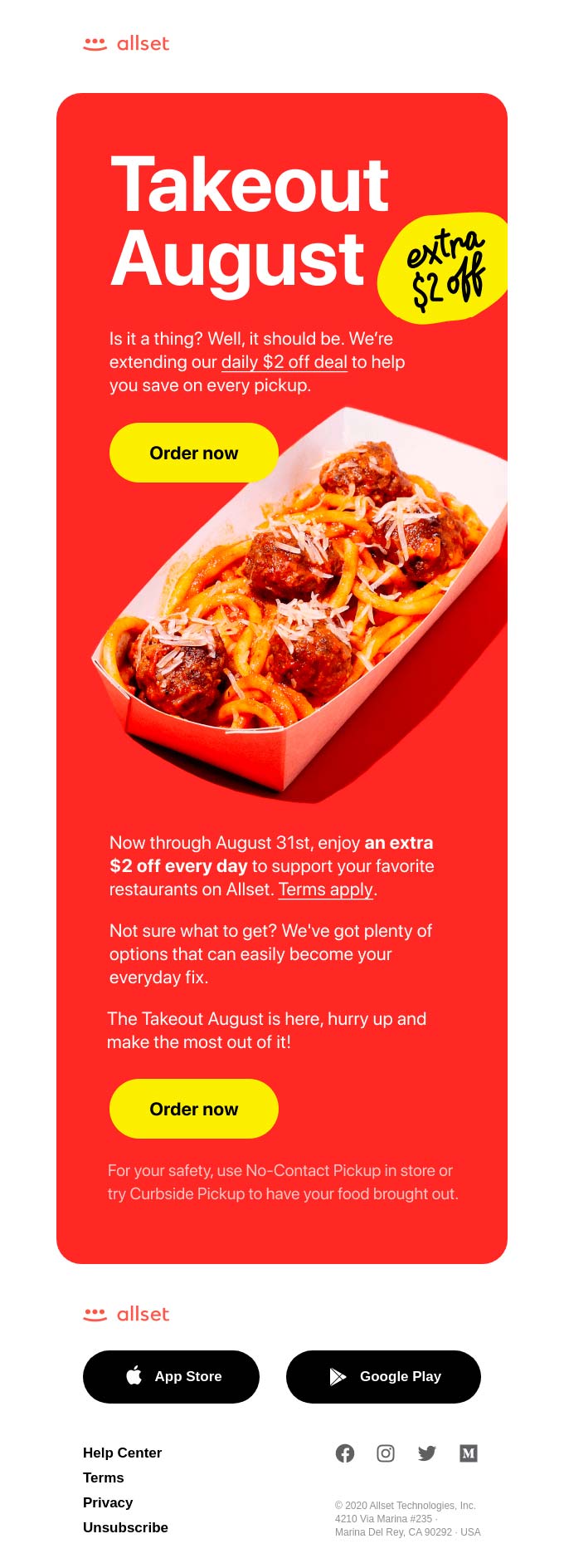
Source: Really Good Emails
With this type of footer, you show that you care about all the details of the design, not just the main image, so it also makes it an element that becomes useful for the customers.
Do not miss anything from our blog and join our Telegram https://t.me/acrelianews
Haven't you tried Acrelia News yet?
If you like this post, you will like much more our email marketing tool: professional, easy to use.