Category: Email Marketing
Welcoming new subscribers is a good practice because, despite being something automated, it makes a great first impression. Since it has a high open rate, it serves as a reference to establish the relationship between sender and recipient. To show you the possibilities you have to create the perfect welcome email, we've compiled 10 examples of how to greet both customers and subscribers you want to convert to customers.
Email marketing can have a personal component, like a conversation between two people who have just met: they greet each other, exchange a few words and send good wishes. This is how letters have always been and can also be a welcome message.
Source: Really Good Emails
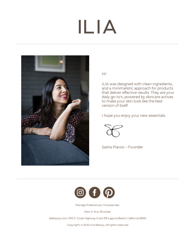
Minimalist email design can be used from the very first welcome email, making it clear from the start that simplicity and functionality are prioritised. This idea can be implemented with a clean image and explanatory text, as in this example.
Source: Really Good Emails
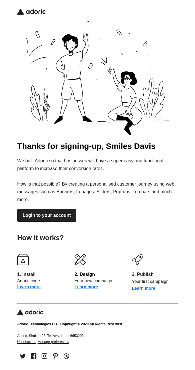
When you send notifications to confirm a registration, you can start to convey the essence of your brand, both in the tone of the message and the images used.
Source: Really Good Emails
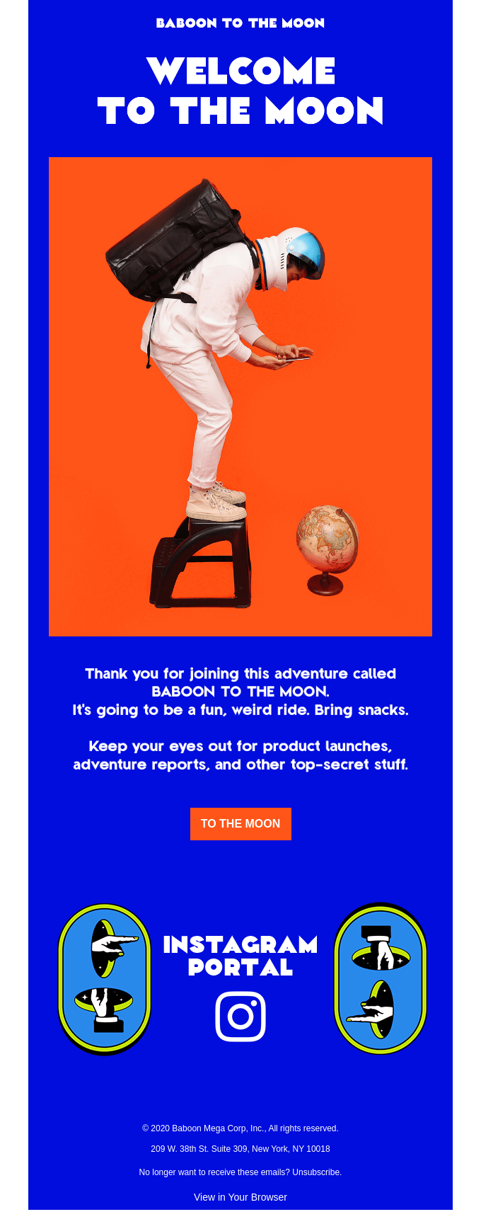
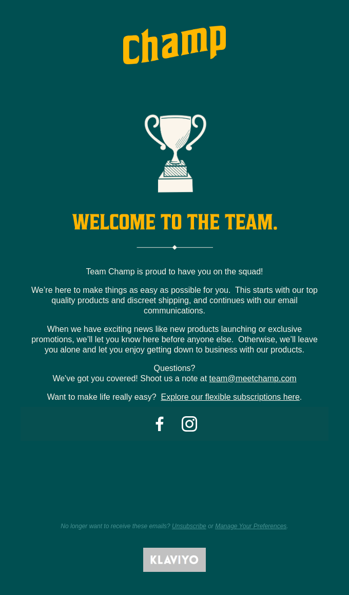
Welcoming to a mailing list can be cold, but welcoming to a group, team or community has the opposite effect. Repeated use of "we" or "our" in the text is key to creating that emotional connection with the brand that becomes one of them.
Source: Really Good Emails
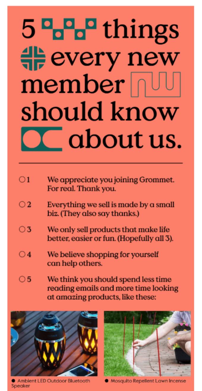
A good example of a welcome email is also a corporate manifesto, i.e. it explains what the company believes in so that its values are understood. In this case, moreover, it does so with humility and by gaining the user's sympathy.
Source: Really Good Emails
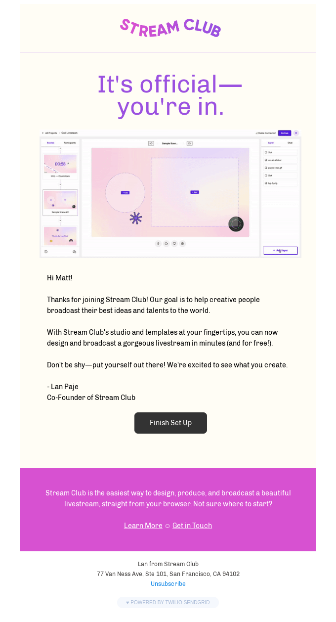
If the user receives an email right after registration, they expect to receive a confirmation in their inbox, but also an indication of the next steps they need to take, for example, to complete their profile or finish the process.
Source: Really Good Emails
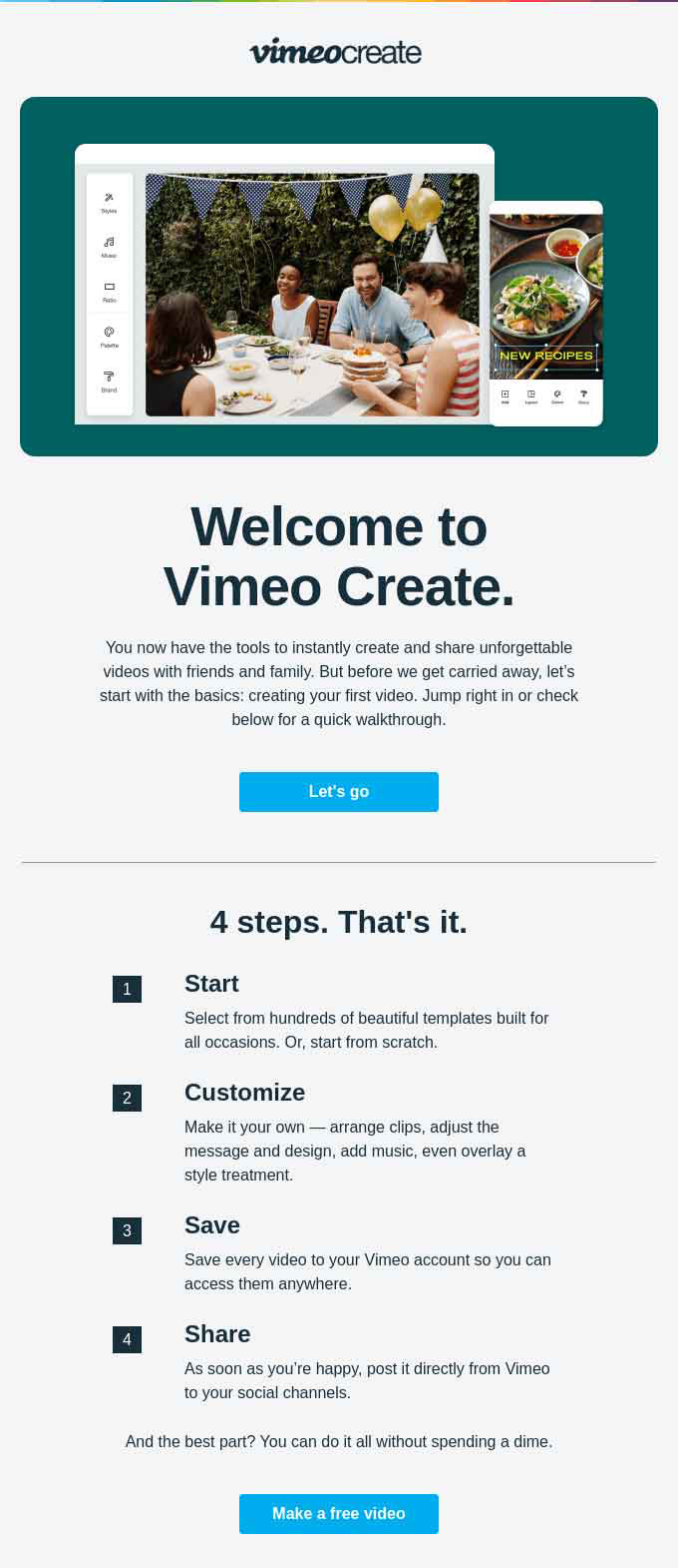
Video is a good ingredient in your email marketing strategy. Make one specifically to greet and welcome them or insert the one you have to explain how your product or service works.
Source: Really Good Emails
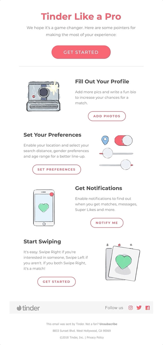
There are many types of possible mailings, but illustrations always add a nice touch. They are distinctive because they are not often used and they also serve to graphically show a process or functionality that new customers may need to know about.
Source: Really Good Emails
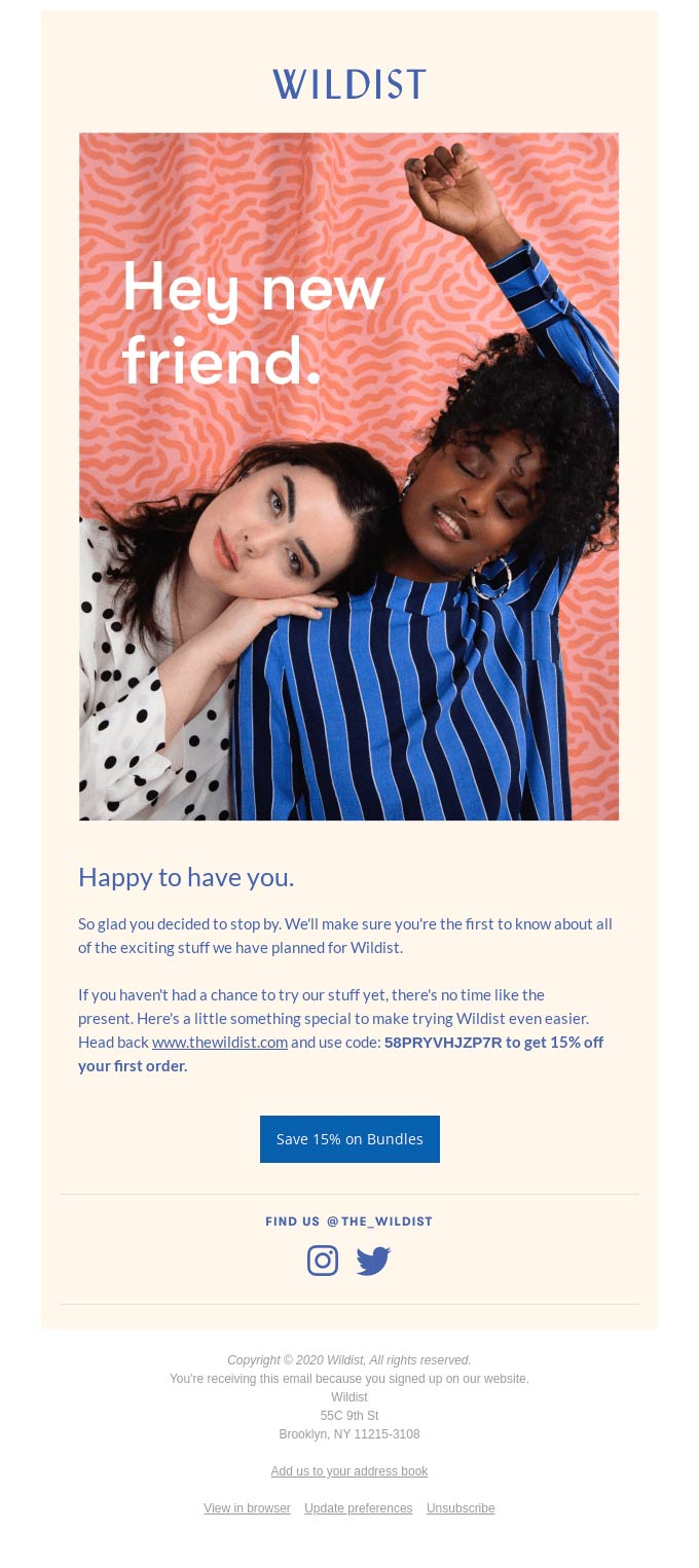
Many first-time customers sign up for the newsletter to receive a discount email for the first purchase or to get free shipping. Even if you want to cut to the chase and get them to use it as soon as possible, you can also indicate the tone of future communications and the corporate style.
Source: Really Good Emails
A shop with a large catalogue can take advantage of the welcome to send an email with the latest news. It serves as a preview of how future newsletters can be and also encourages the first purchase (even if there is no associated promotion).

Source: Really Good Emails
Do not miss anything from our blog and join our Telegram https://t.me/acrelianews
Haven't you tried Acrelia News yet?
If you like this post, you will like much more our email marketing tool: professional, easy to use.