Category: Email Marketing
There are surprising markets with brands that may seem extravagant and products that you wouldn't expect to sell. But "the unusual" can also come from the way a promotion is communicated, like the following strange email marketing campaigns that will stand out for being different from the norm, some leveraging their alternative image in general and others only at specific moments.
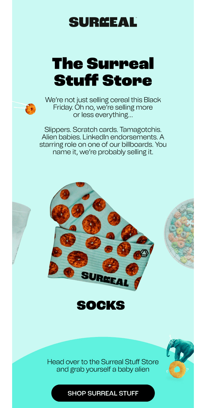
On days with a lot of activity, such as Black Friday, Valentine's Day, or the sales season, creating a strange campaign can serve to grab attention above the rest. In this case, the oddity can result from both the choice of products to display and the tone used to explain them.
Source: Really Good Emails
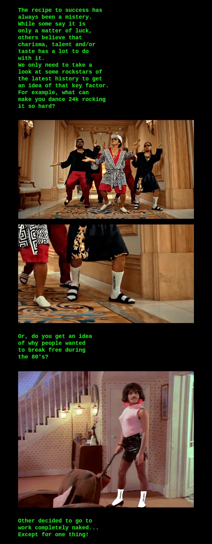
Artificial intelligence can create any image, increasingly realistically, but in the most curious campaigns, you can find some retouched in a way that doesn't hide that they are fake. Instead, on the contrary: it can be boasted that someone uses our products with a montage that anyone recognizes as humorous.
Source: Really Good Emails
Flowcharts are a fantastic resource to illustrate decision-based processes and guide the customer in the right direction. What happens when it unnecessarily lengthens or includes a response that has nothing to do with a normal procedure? Well, it becomes strange.

Source: Really Good Emails
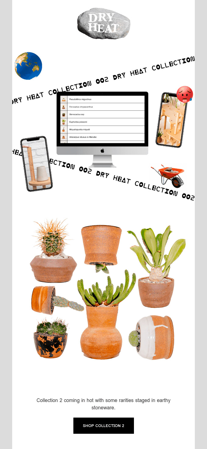
It's so uncommon for a product to be photographed in a way that doesn't favor it that seeing it upside down or sideways, as in this example, is surprising. If we add to this a header with a somewhat difficult-to-read font and some icons placed without much thought, we have a campaign that undoubtedly grabs attention.
Source: Really Good Emails
Another example of a campaign for a specific promotion is a Black Friday, but here a video has been produced, and its trailer is sent as news by email. The unheard-of thing is that the offer appears in small, and they use images of the team dressed in, let's say, curious ways mixed with those of the products.

Source: Really Good Emails
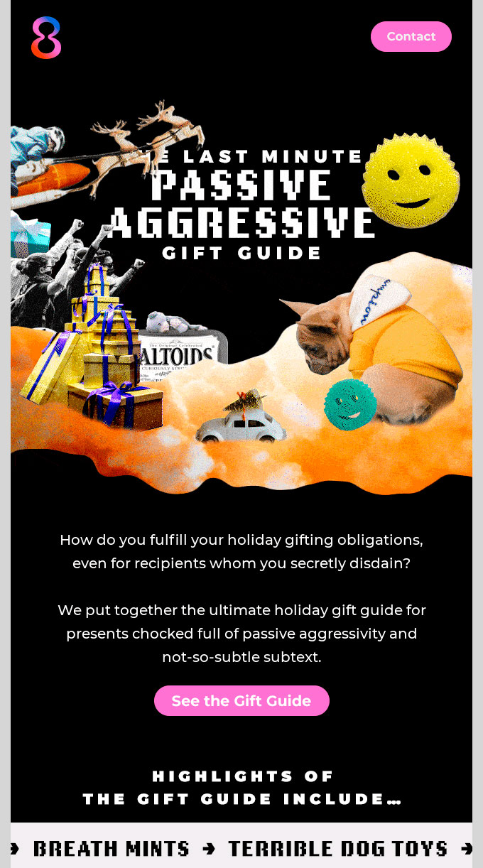
Imagine you don't have time to create a new header, and you come up with mixing some images almost like a collage, not worrying too much about the final result. That's called improvising and can end up being a disaster for your image... unless you frame it within a last-minute gift campaign to give it meaning.
Source: Really Good Emails
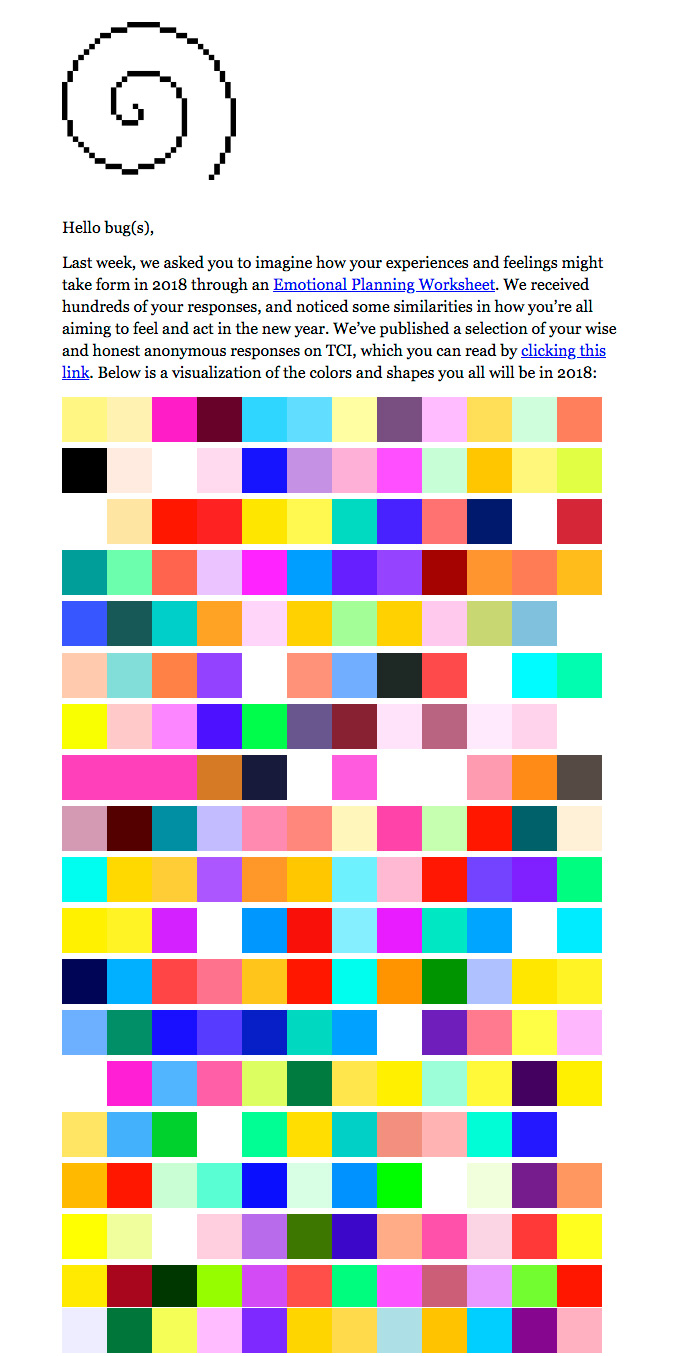
Skipping good practice recommendations is a decision that can be justified if done from time to time. In this example, you have to scroll several times to get past the colorful images and icons to reach the minimal explanation and the rest of the contents of the shipment. Strange, isn't it?
Source: Really Good Emails
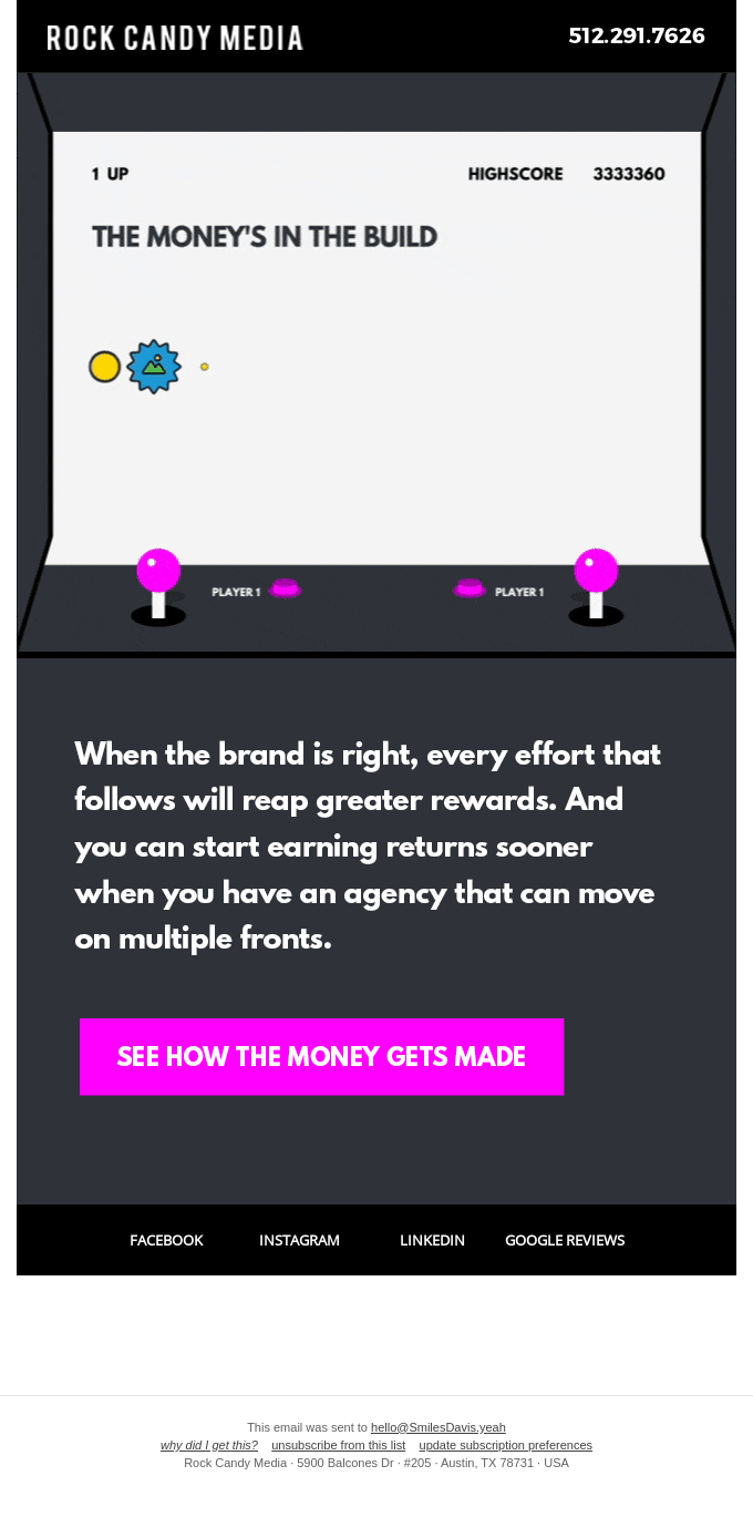
It's not that this style is strange; what doesn't quite fit is taking it to this extreme. The oddity may be in the eyes of the beholder, but when almost the first thing you see is an image with icons you don't understand, do you keep reading or delete the message?
Source: Really Good Emails
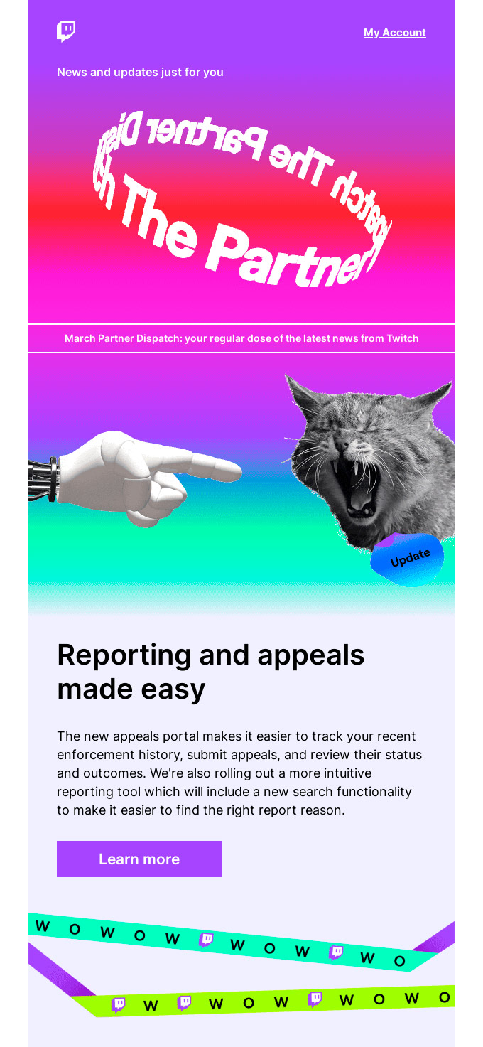
Few brands can use the image of a unicorn coming out of a screen and surrounded by smiling emojis. There aren't many that use the word "WOW" and its logo as a section separator. If you can do it, go ahead! Surely your subscribers expect it, if not, better leave the weird things to others.
Source: Really Good Emails
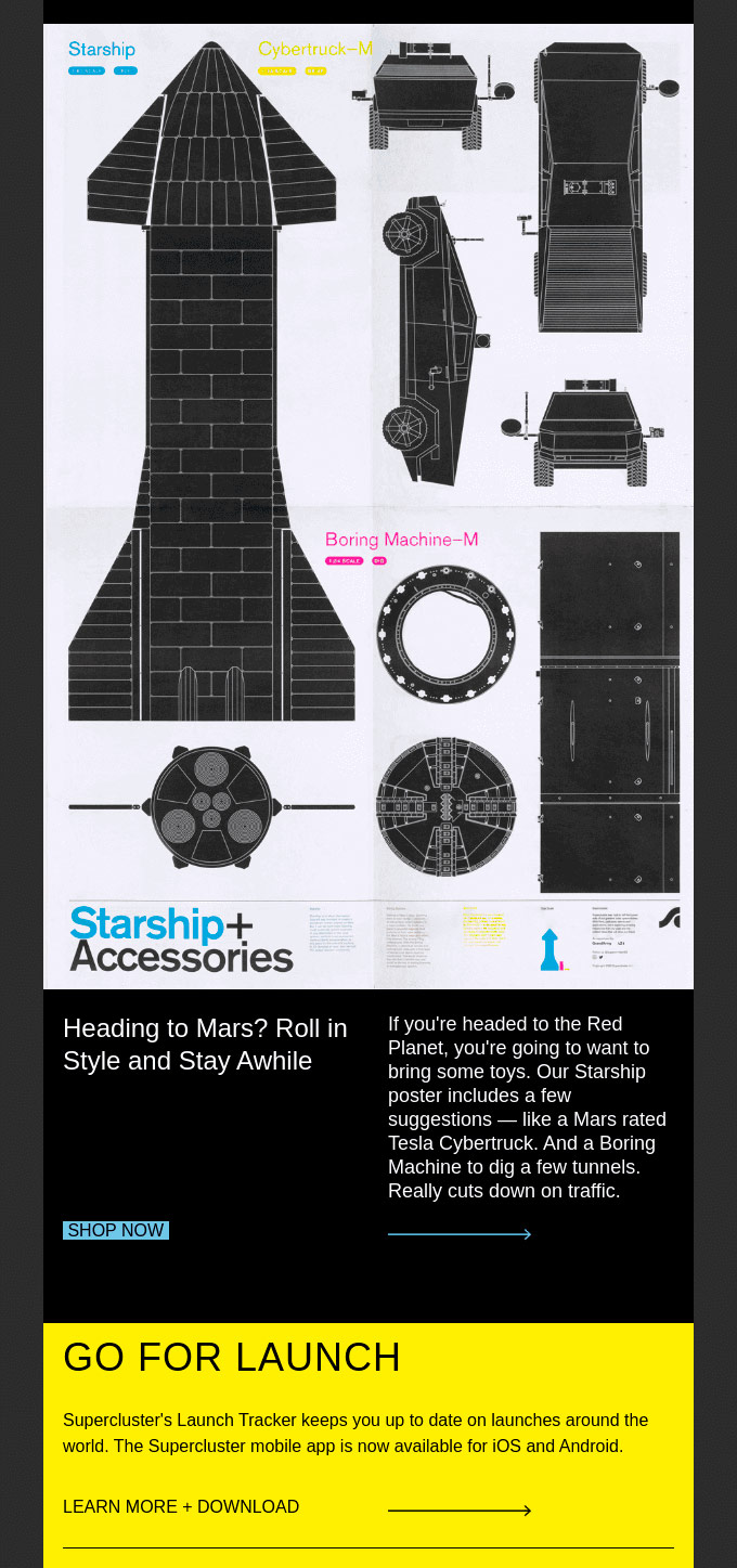
Maybe it sounds strange that they explain to you how not to design a space station or ask you if you're going to travel to Mars to sell you a poster about spaceships, but maybe not so much if you can also download an app to follow space launches. An example of a thematic message that will only be strange to non-customers.
Source: Really Good Emails
Do not miss anything from our blog and join our Telegram https://t.me/acrelianews
Haven't you tried Acrelia News yet?
If you like this post, you will like much more our email marketing tool: professional, easy to use.