Category: Email Marketing
Organising an event requires a lot of effort, especially when it comes to large trade fairs and congresses with hundreds of participants who need to be kept informed. Email marketing is the perfect tool to make it a success in terms of participation and results for your company.
With the following 10 examples, you can see the possibilities it offers to your business.
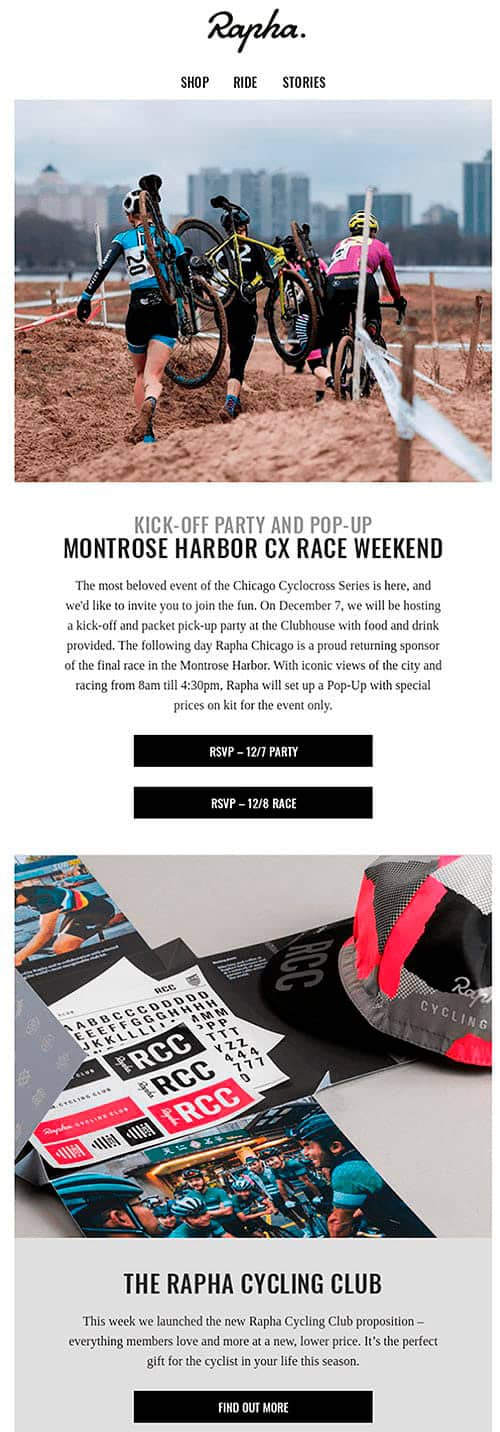
When you are still preparing for the trade show, RSVP messages are a good way to find out how many people might be interested, for example in a face-to-face meeting or a private session with a commercial focus. They are also a good solution for post-official events, such as dinners with some speakers or informal parties.
or informal parties.
Source: Really Good Emails
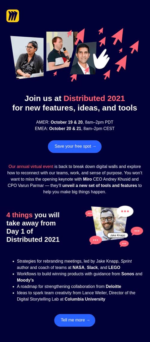
You may have already sent out a teaser campaign to generate interest, but for the launch, you need to pull out all the stops and make sure that not only the basic information (venue, time) is there, but also the reasons why they should register right then and there. Four or five should be enough to justify the
enough to justify the investment of time or money for tickets.
Source: Really Good Emails
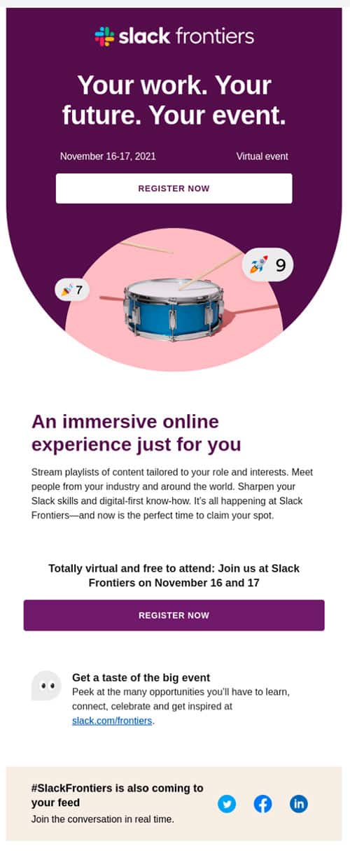
The call to action should always be visible without scrolling and should stand out in terms of colour contrast or typography. In addition, another button can be added before the goodbye, preferably with the same text. At an event, verbs that emphasise free registration or ticket purchase are often used, especially if there is a capacity limit.
Source: Really Good Emails
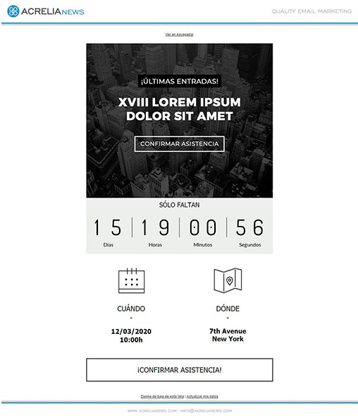
The most visual way to make sure no one misses the date of the event is with a countdown. Our template shows the days remaining, as well as graphically displays the event information.
the information of the event. Remember that you can customise it with your corporate colours and image to include, for example, the official poster or the keynote speaker.
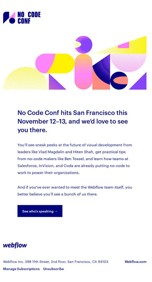
It is essential to have a page that gathers all the information about the event, so the email can be a communication that serves only as a warning for them to visit it. For example: if you have added information about the place where the event will be held or the updated list of speakers. This can be for people who have already registered or for those who have not yet done so.
Source: Really Good Emails
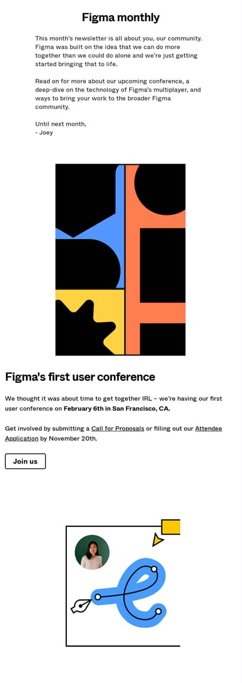
For any promotion, it is usual to create specific campaigns like all the ones we are looking at in this list of examples, but you can also include a mention in your regular newsletter. Both options are perfectly compatible and the presentation of the congress follows the personal tone of the mailings.
Source: Really Good Emails
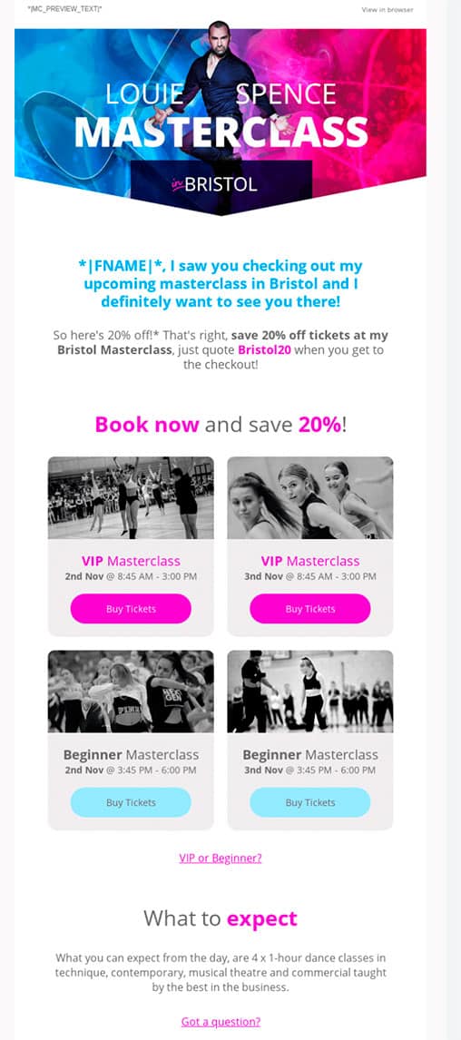
Early birds are usually given some advantage in the registration process, typically a discount. Another possibility is to offer it when there are only a few days left to convince those who have not yet registered. A tip: control the percentages so that they are proportionate to each other.
Source: Really Good Emails
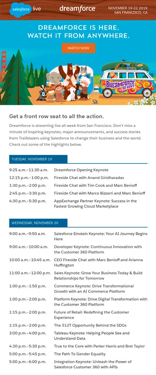
It is very common for programmes to change and for last-minute adjustments to be made, so it is good practice to send the final version the day before the event. This way, even if it is a longer email than usual, you make sure that all attendees have the updated information.
Source: Really Good Emails
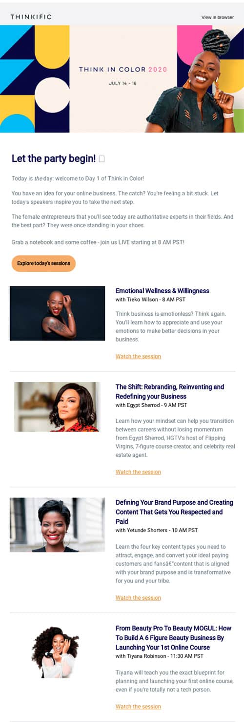
If the congress presentations are broadcast live or recorded, remind virtual attendees of the calendar so that they don't miss anything. This is another way of explaining the programme, but in a more concrete way for people who cannot attend in person. Remember to segment well to send each person what they need!
Source: Really Good Emails
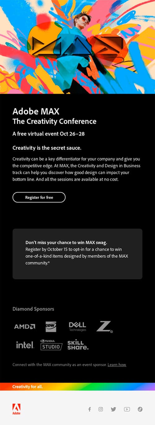
We have already seen that the design can be minimalist with just a link to a landing page or with the whole programme. But something that should not be missing is the space for the logos of the companies that collaborate in the event. Even if they are the companies of the speakers, it is important to give them visibility in all communications, both to thank them for their participation and to demonstrate the scope of the event to the attendees.
Source: Really Good Emails
Do not miss anything from our blog and join our Telegram https://t.me/acrelianews
Haven't you tried Acrelia News yet?
If you like this post, you will like much more our email marketing tool: professional, easy to use.